Besties Layout | Brianna Lepper
Hey friends! Brianna Lepper here today sharing a new layout using the Life Right Now collection. I was really inspired by the "B" side of the Retail Therapy 12x12 patterned paper and wanted to base my layout around some of the diamond shapes. Here's my layout:

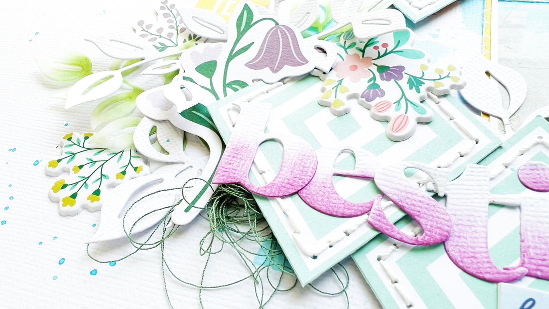
To start, I fussy cut a few of the diamonds out and did some hand stitching around the perimeter of each one. I usually don't do a lot of hand stitching, but I'm so glad I added it. I love both the texture and look of the thicker thread.

Next, I watercolored the Summer Shower ink pad on a piece of textured white cardstock to mimic the pool in my photo. I popped up the stitched diamonds on foam tape and arranged them on the right side of my page.

I die cut my title using the Heather Lowercase dies and ink blended on an ombre pattern on each letter using the Candy Violet ink pad. I then arranged the letters right on top of two of the diamonds that were stacked together. I love how much that ink color pops!!

Next, I added in a few of the Floral Ephemera around the diamonds. I wanted a little something extra, so I die cut a few leaves using the Curvy Leaves die set. I ended up cutting them on white cardstock and vellum. To add more interest to the vellum leaves, I ink blended each one using the Evergreen and Olive ink pads. I then tucked and layered them into my embellishment clusters.

I also added in a few Chipboard Flair and Puffy Stickers. I tucked in a Chipboard Frame to my bottom cluster and added in a few Enamel Dots as finishing touches around the page.

Here's one final look:

Thank you so much for stopping by today, I hope that I've inspired you in some way! Have you tried ink blending your die cut pieces? It's really fun to do and you can get really creative. You can turn them into your own DIY embellishments and use them on all of your projects! Thanks again for being here and I'll see you in my next post friends!
Brianna


1 comment
Hi,
Love, love PF collections. I have just one suggestion….the projects shown here are so pale the details are somewhat hard to appreciate. I think more contrast is needed.