
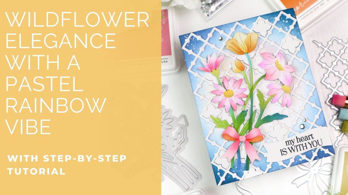
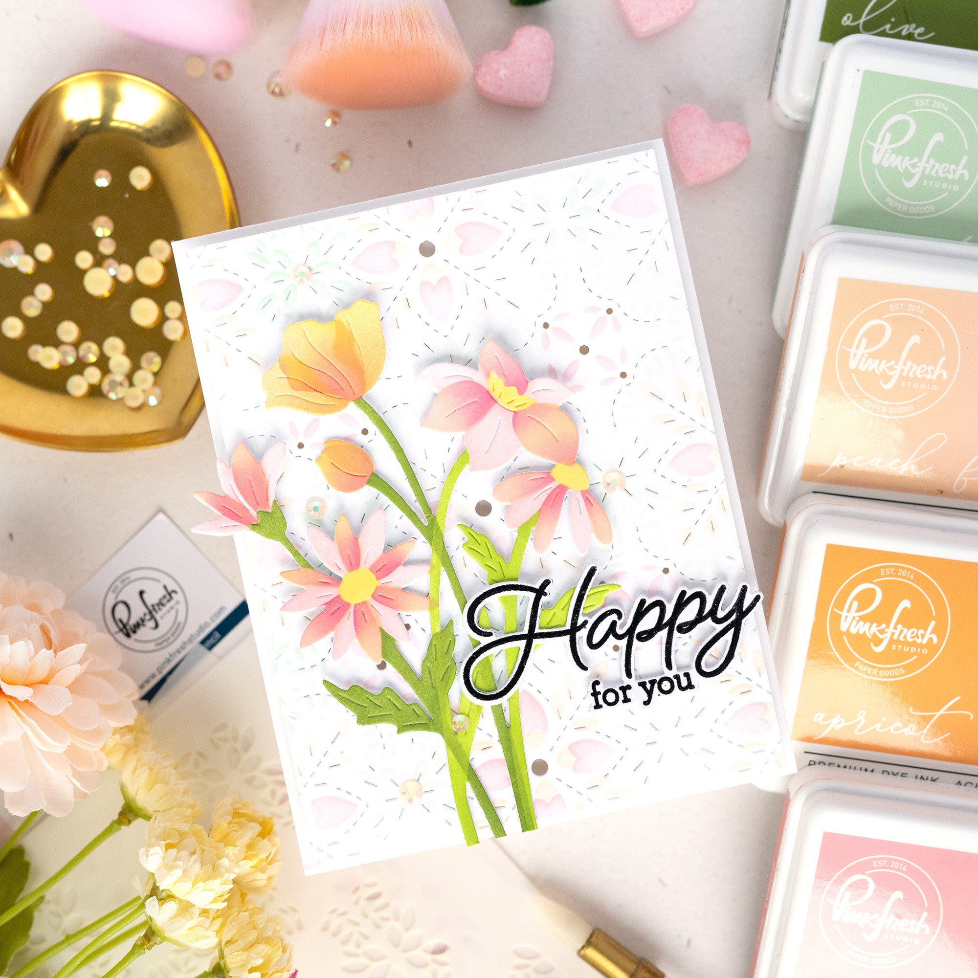
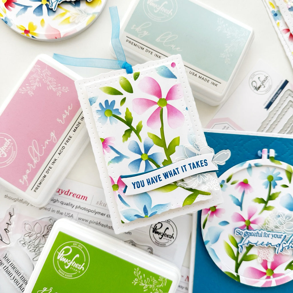
Happy New Year, everyone! I hope the New Year brings you endless crafty joy and inspiration! It’s TaeEun here today, sharing a pastel rainbow floral card created for the Pinkfresh Studio January 2026 Challenge.
This month’s challenge is a Year in Review, where we get to revisit any monthly challenge from 2025. I chose the June 2025 Challenge, “Rainbow Reverie,” which features a soft, dreamy pastel rainbow color palette. While my card doesn’t include a literal rainbow, I interpreted the theme by coloring the florals of the Wildflower Elegance suite in gentle pastel hues that echo that rainbow-inspired feel.

*Disclaimer: All products used are linked below as clickable images. If a product isn’t listed, it’s been discontinued.

Here is how I made this card.
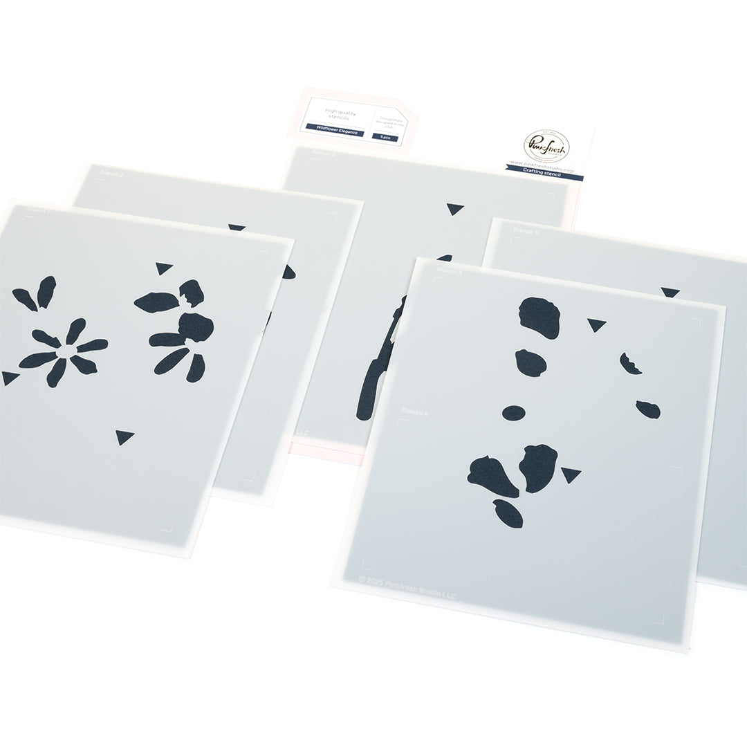
- Stencil the Wildflower Elegance using the following ink colors:
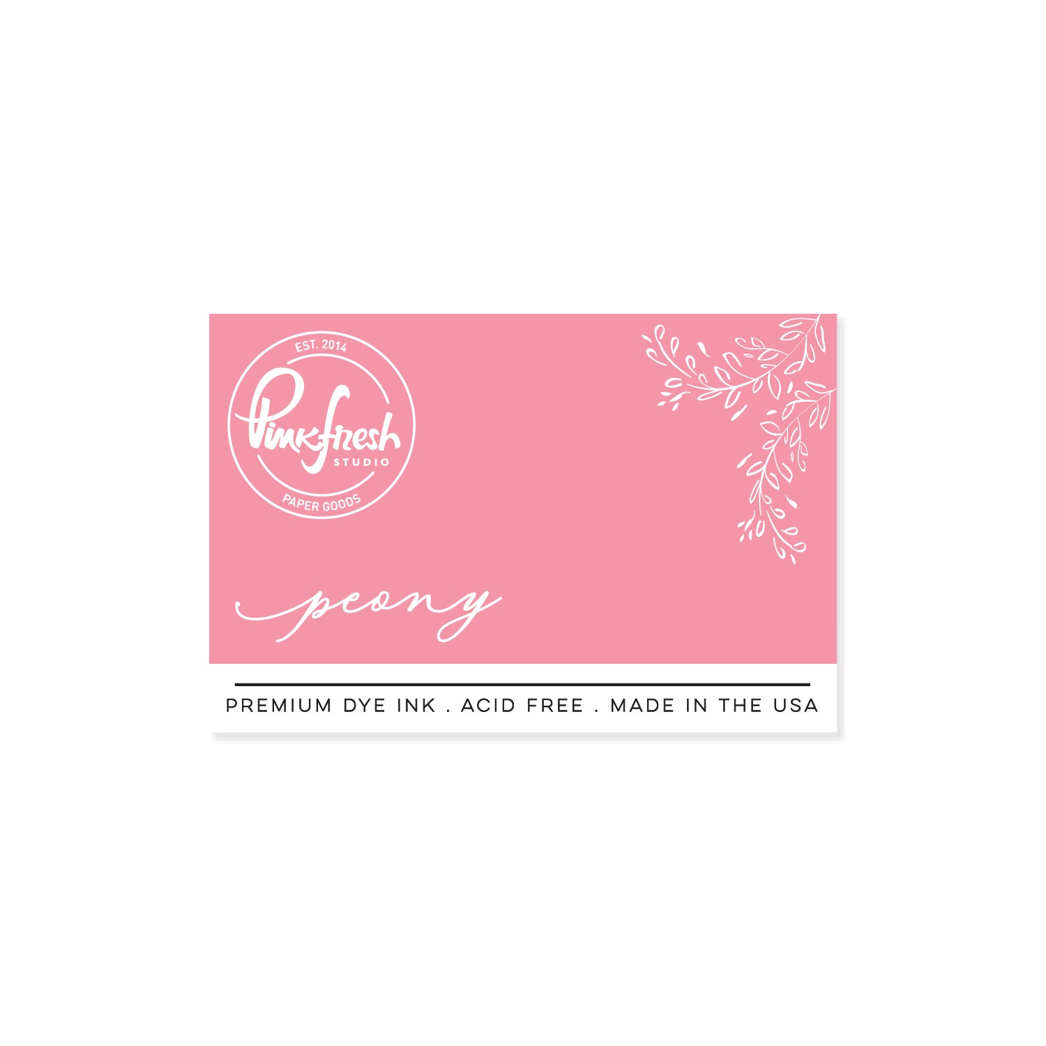
- Pink flowers: Bubble Gum, Peony
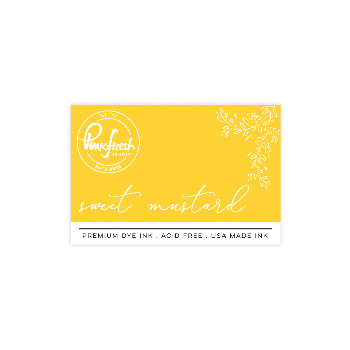
- Flower centers: Sweet Mustard, Warm Buff
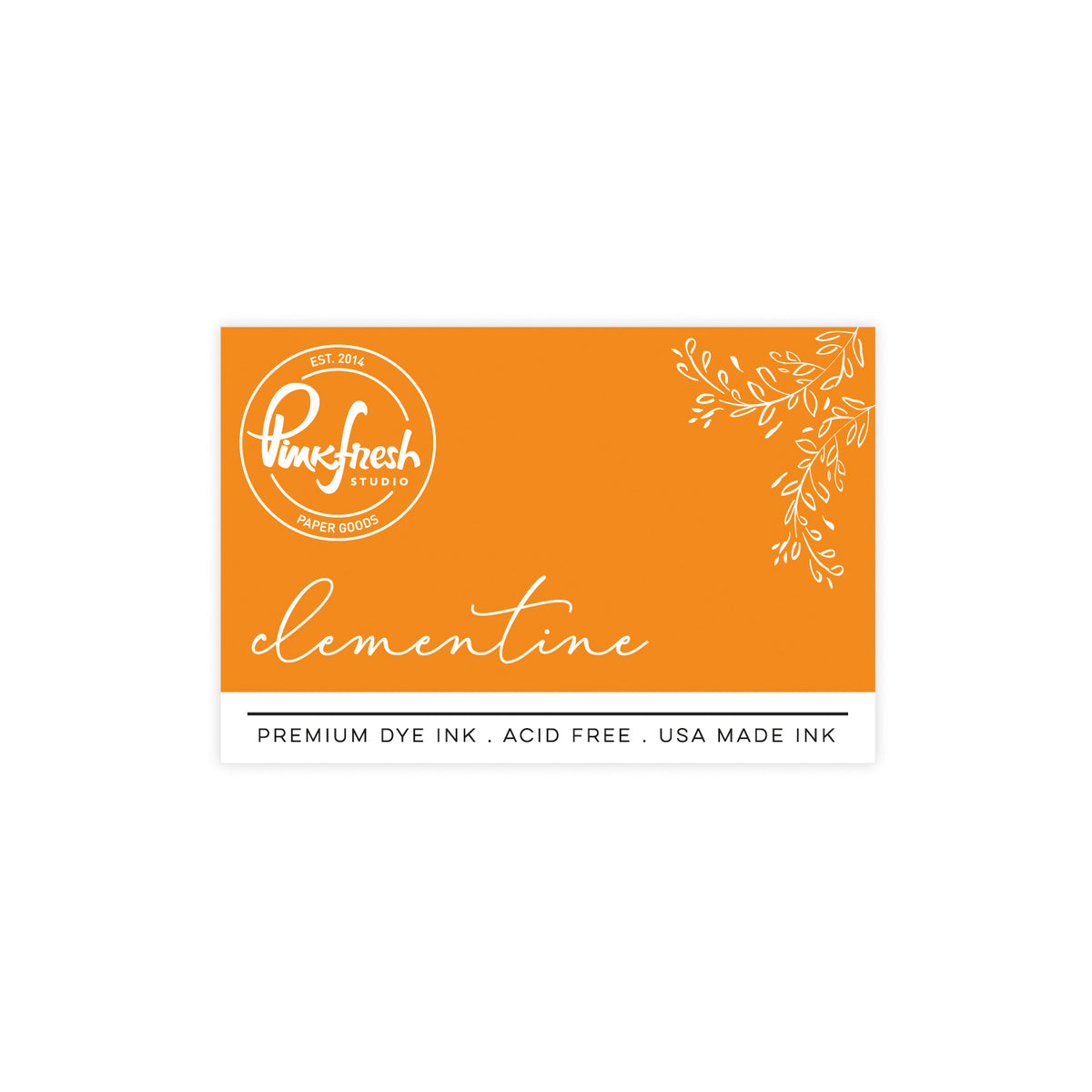
- Orange flowers: Apricot, Clementine
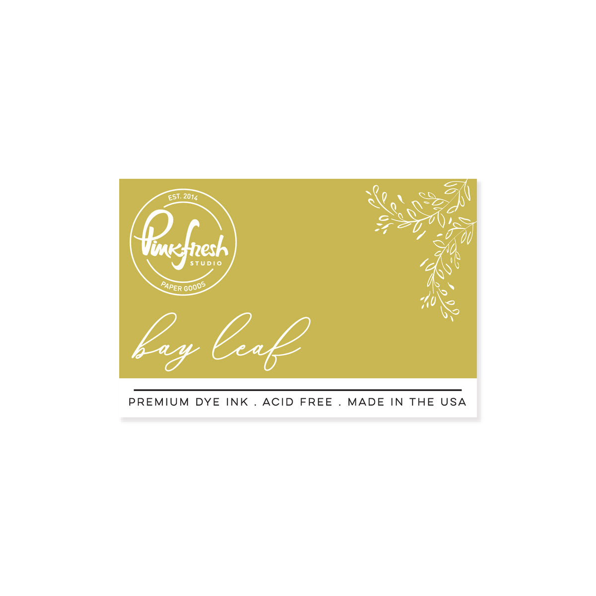
- Greenery: Bay Leaf, Grassy Knoll, Paradise, Seaside
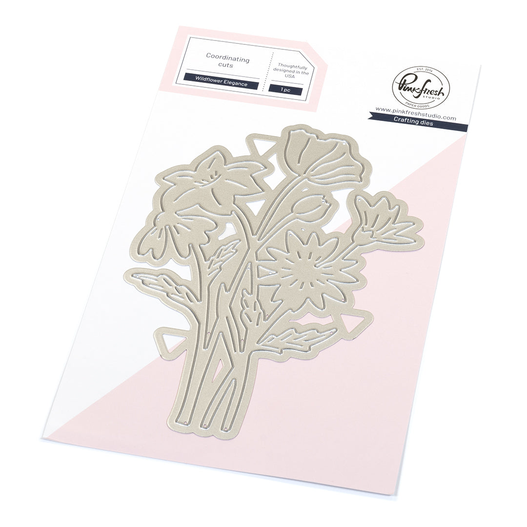
- Die-cut the Wildflower Elegance using the coordinating die.
- Ink blend two diagonal corners of a white A2 sized panel with Seaside and Storm and the opposite diagonal corners in Paradise und Atlantis, keeping the edges darker for framing.
- Ink blend Coral Reef and Apricot very lightly into the center of the panel to create a subtle glow.
- Splatter white opaque ink over the background panel and allow it to dry completely.
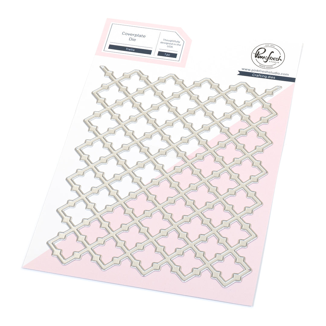
- Die-cut the Trellis from white cardstock and stack it with two additional Trellis die-cuts for added dimension.
- Adhere the background panel to a white cardbase, then attach the Trellis on top.
- Inlay some inner pieces of the Trellis using foam tape to add visual interest.
- Add the Wildflower Elegance image with foam tape to the card.
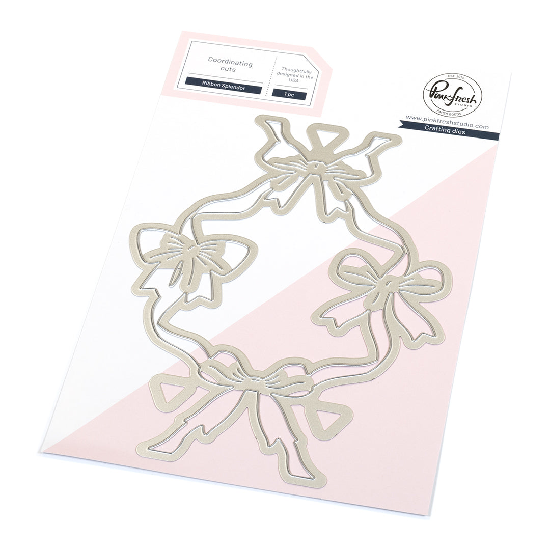
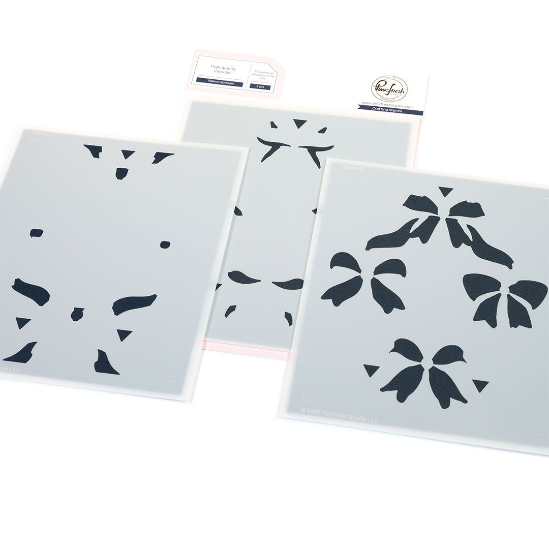
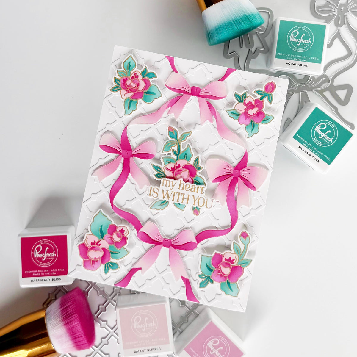
- Stencil a ribbon from the Ribbon Splendor suite in Peony, Passion Fruit and Apricot, die cut using the coordinating die and add it to the floral cluster.
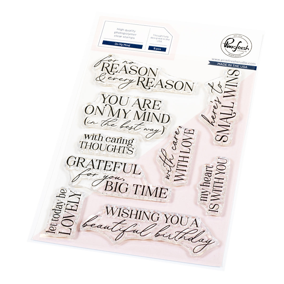
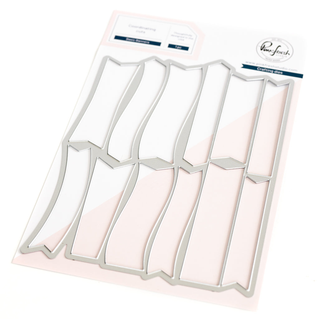
- Stamp the sentiment from the On My Mind set in Detail Black and cut it out using the Basic Banners die.
- Finish the card with a few Ice Clear Drops

TIP: When working with pastel colors, adding darker ink around the edges of your background helps frame the design and prevents soft shades from looking washed out. It creates subtle contrast while keeping the overall look light and airy. For added interest, try selectively popping up small elements from a die-cut background with foam tape - it can make a simple design feel extra special.
I hope this card inspires you to play along in the January 2026 challenge! One lucky participant will win a $50 gift card to the Pinkfresh Studio Store! All entries, both card and memory keeping, are eligible to win the prize!
To join the fun, simply create a new paper project featuring Pinkfresh Studio products as the main focus ! Be sure to visit the monthly challenge post for full details and more inspiration!
Thank you so much for stopping by today!
Wishing you a crafty day!
TaeEun
Recommended Products



































Leave a comment
All comments are moderated before being published.
This site is protected by hCaptcha and the hCaptcha Privacy Policy and Terms of Service apply.