
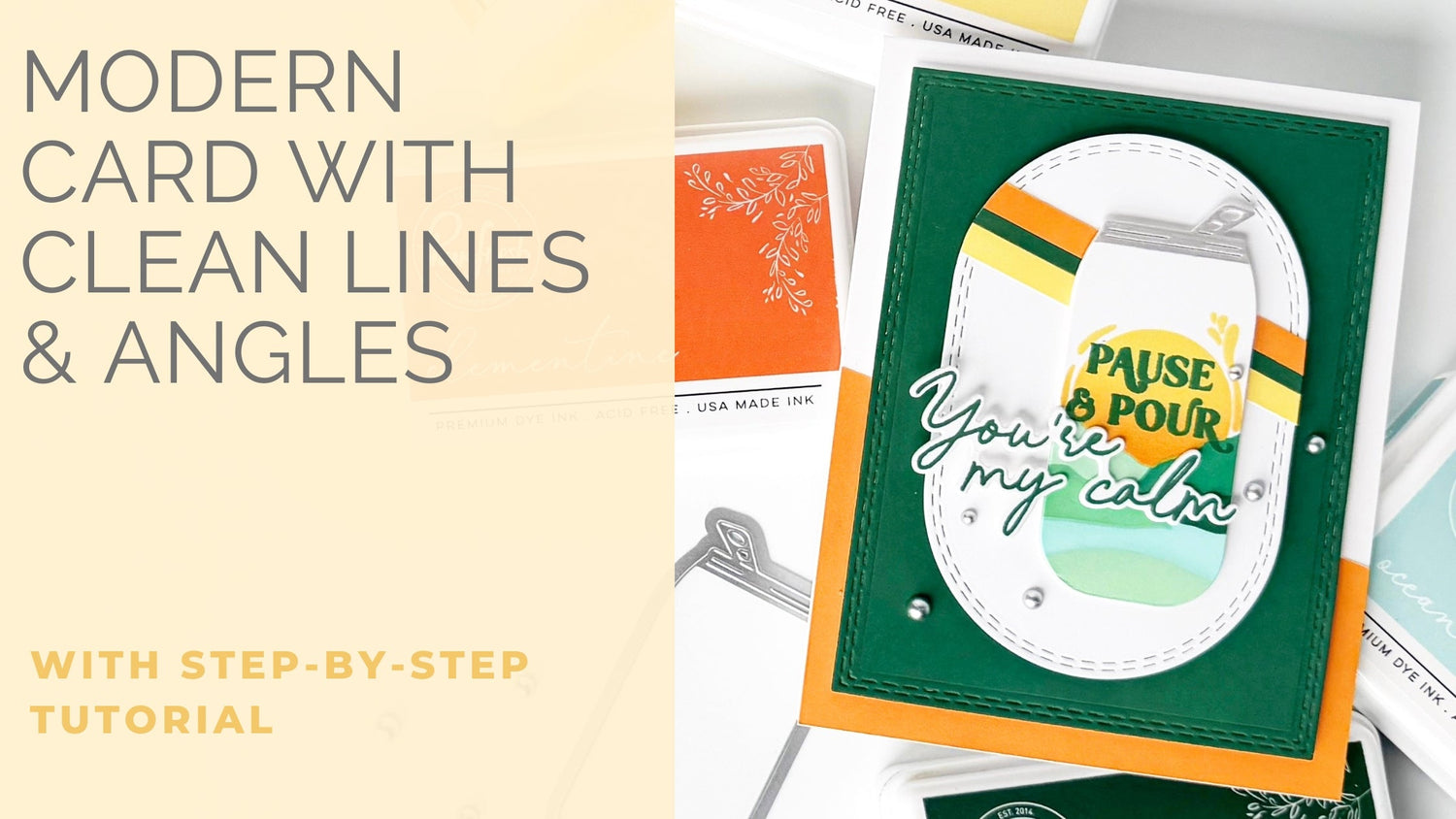
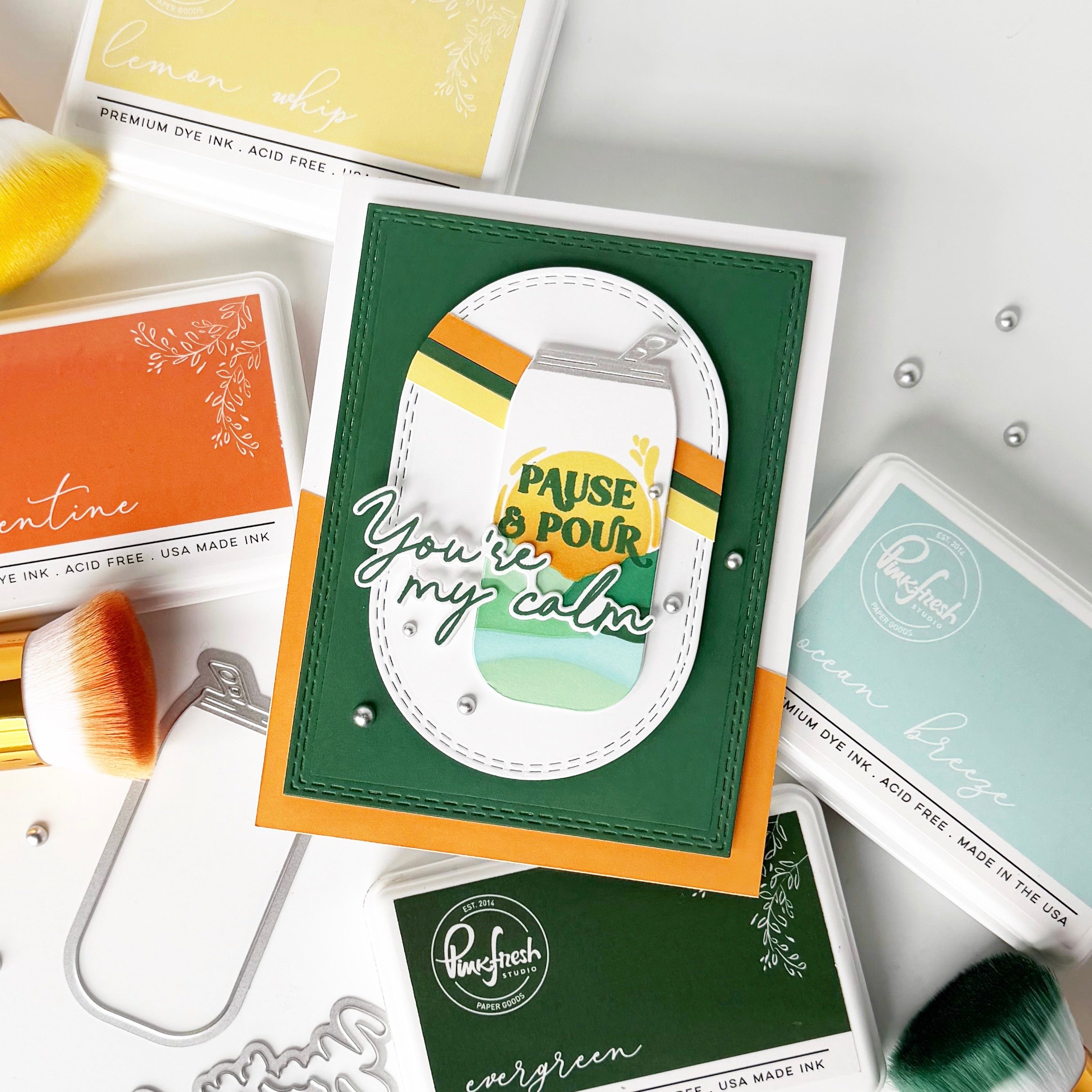
Graphic card designs can feel intimidating at first because they rely so heavily on strong shapes, clean lines, and bold color choices. There is not a lot to hide behind when the design is simple, which is exactly what makes this style so striking. Every layer matters, every angle feels intentional, and every color plays an important role in the finished look.
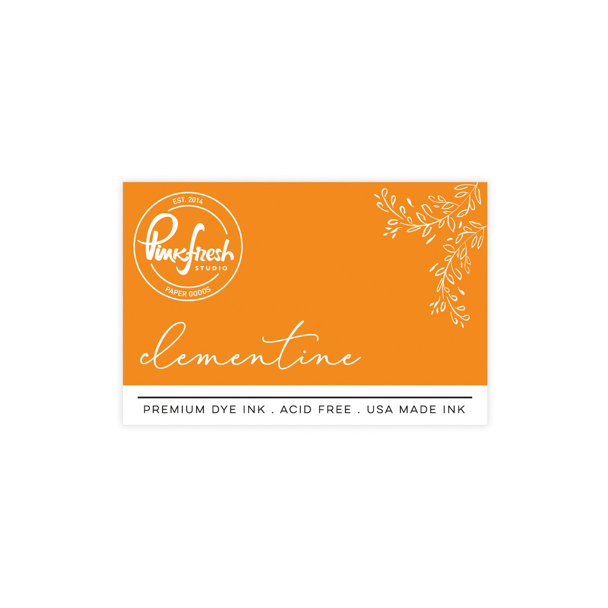
For this card, I leaned into a bold palette of Evergreen, Clementine, Lemon Whip, and white to create something that feels fresh, modern, and full of energy. The strong diagonal lines help draw your eye across the design, while the oversized focal point keeps everything grounded. I love that this style feels polished without requiring lots of tiny details or embellishments.
One of the easiest ways to make a clean and simple card feel more interesting is to play with contrast. Pairing soft blended color with crisp white die cuts creates a design that feels both graphic and dimensional. The addition of silver details gives this card just enough shine to feel finished while still letting the bold shapes remain the star.
*Disclaimer: All products used are linked below as clickable images. If a product isn't listed, it's been discontinued.

How to re-create this card:
- Create a top-folding A2 card base from white cardstock and set it aside.
- Ink-blend separate A2 panels of white cardstock with Clementine, Evergreen, and Lemon Whip ink, and allow the ink-blended panels to dry completely.
- Cut one thin strip in varying widths from each of the three ink-blended panels and set them aside.
- Trim the Clementine panel at an angle and adhere it directly to the front of the card base.
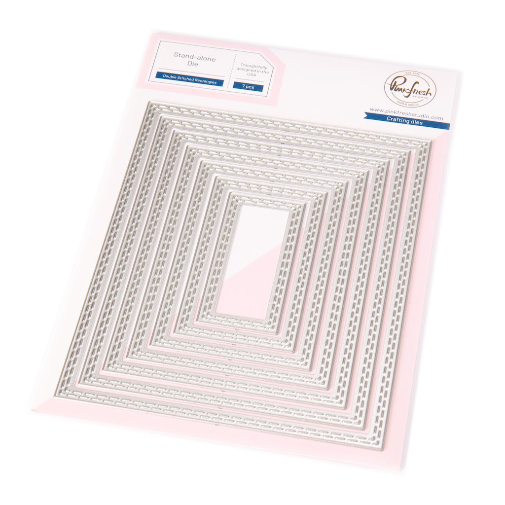
- Die cut the second largest Double Stitched Rectangle from the Evergreen panel.
- Die cut the third largest Double Stitched Elongated Oval from white cardstock.
- Adhere the three colored strips across the white oval at an angle that matches the Clementine panel underneath, then trim away the excess.
- Use the Sipable Scenes stencils to stencil the design onto a 5 1/2" x 5 1/2" piece of cardstock.
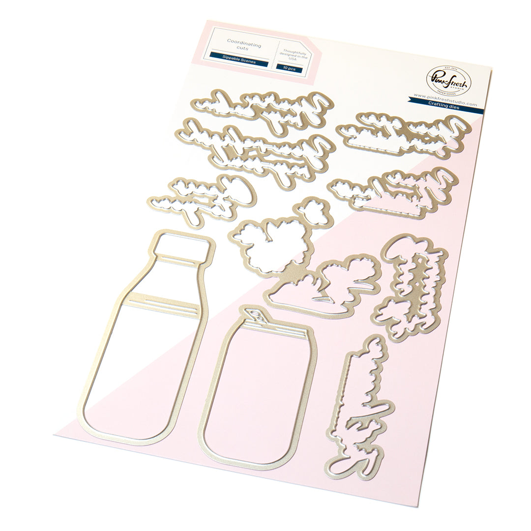
- Die cut the finished can along with an extra blank die cut, then adhere them together for added stability.
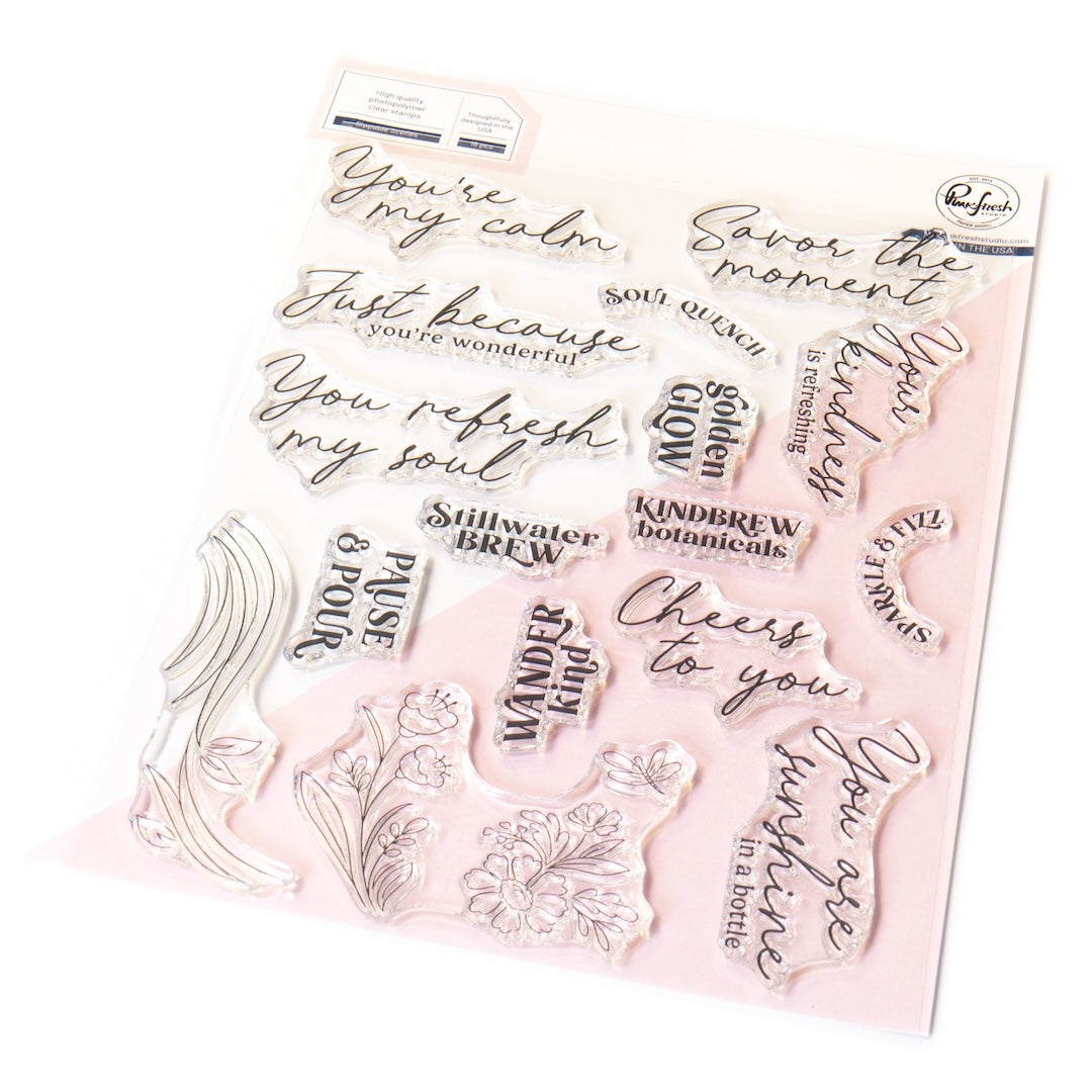
- Stamp the sentiment in Evergreen ink, then die cut or trim it along with a second blank layer and adhere them together.
- Mask off the top portion of the can, then ink-blend silver ink onto it to create a metallic look. Set it aside to dry.
- Adhere the can to the oval panel using thin foam tape.
- Adhere the oval to the green stitched rectangle using thick foam tape.
- Adhere the green rectangle to the card base using thick foam tape.
- Attach the sentiment with liquid glue.
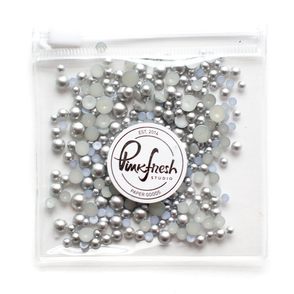
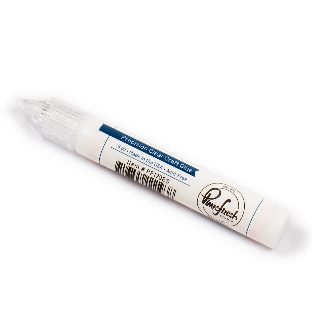
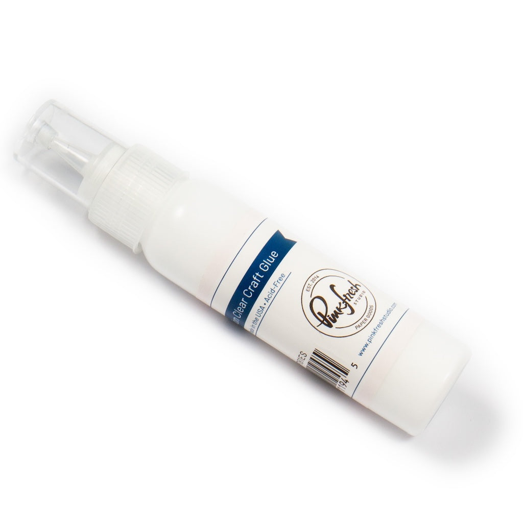
- Finish the card by adding matte silver pearl embellishments with Precision Clear Craft Glue.

I hope this card inspires you to experiment with bold color, graphic shapes, and unexpected angles on your next project. Sometimes, the most eye-catching designs come from keeping things simple and letting a few strong design choices do all the work.
If you give this style a try, I would love to see what you create. Tag us on Instagram with your version of this card and let us know what color combination you would choose for your own bold graphic design.
Recommended Products































Leave a comment
All comments are moderated before being published.
This site is protected by hCaptcha and the hCaptcha Privacy Policy and Terms of Service apply.