
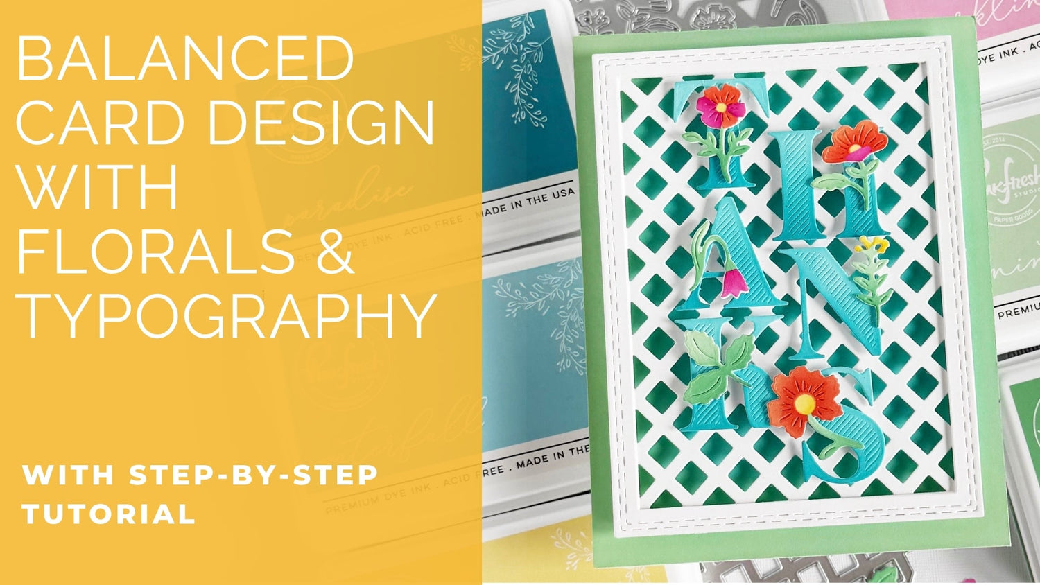
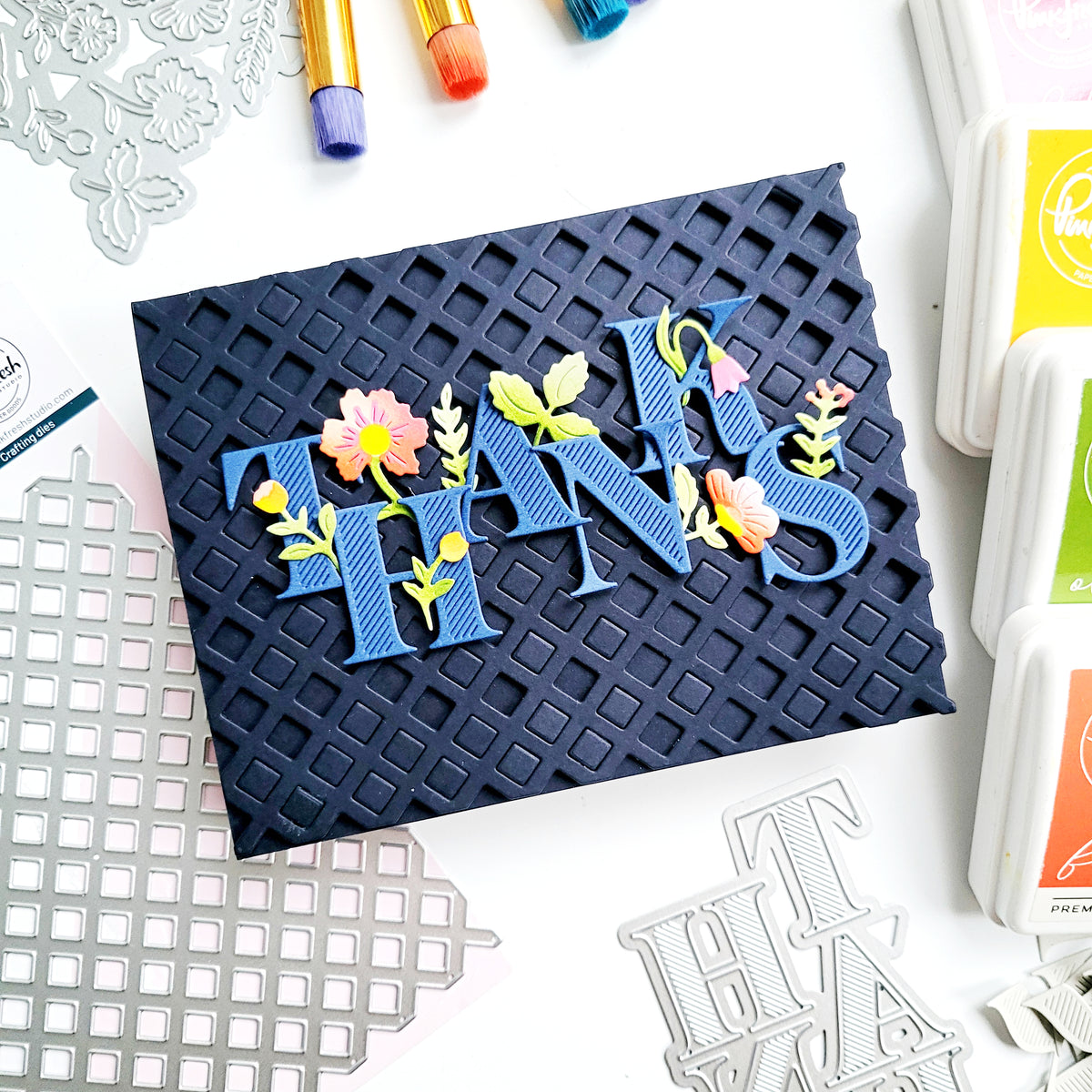
When florals meet structure, something magical happens. In this project, I used the Bloom of Thanks suite to explore the balance between organic movement and precise geometry. Each flower and greenery element was intentionally positioned to echo the angles and lines of the die-cut letters, creating natural flow and rhythm throughout the design. Layered over a crisp lattice background and framed with stitched edges, the dimensional letters appear to grow upward—like blooms reaching through a trellis—bringing harmony and visual energy to the card.
*Disclaimer: All products used are linked below as clickable images. If a product isn’t listed, it’s been discontinued.

How to recreate this card:
- Create an A2 top-folding card base.
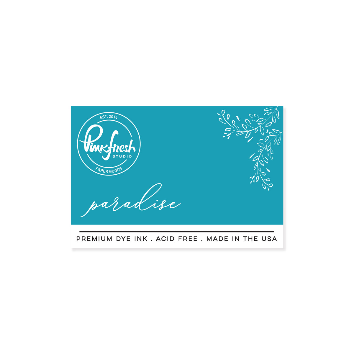
- Ink blend an A2 white cardstock panel using Mint on the outer edges and Waterfall on the inner area that will be behind the framed lattice. Ensure the colors blend seamlessly into one another, and avoid leaving any white space on the panel. Adhere to the card base using foam adhesive.
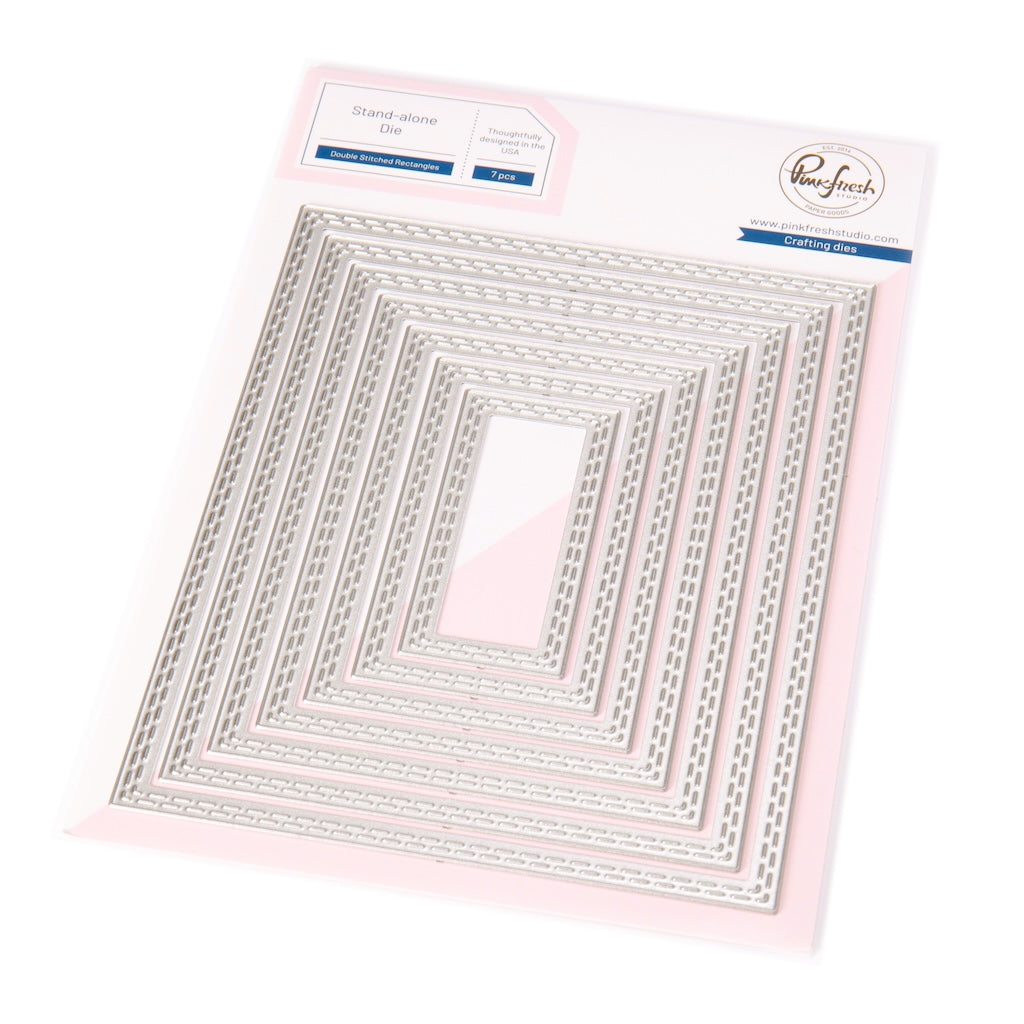
- Using the second and third-largest dies from Double Stitched Rectangles, cut and glue three frames together.
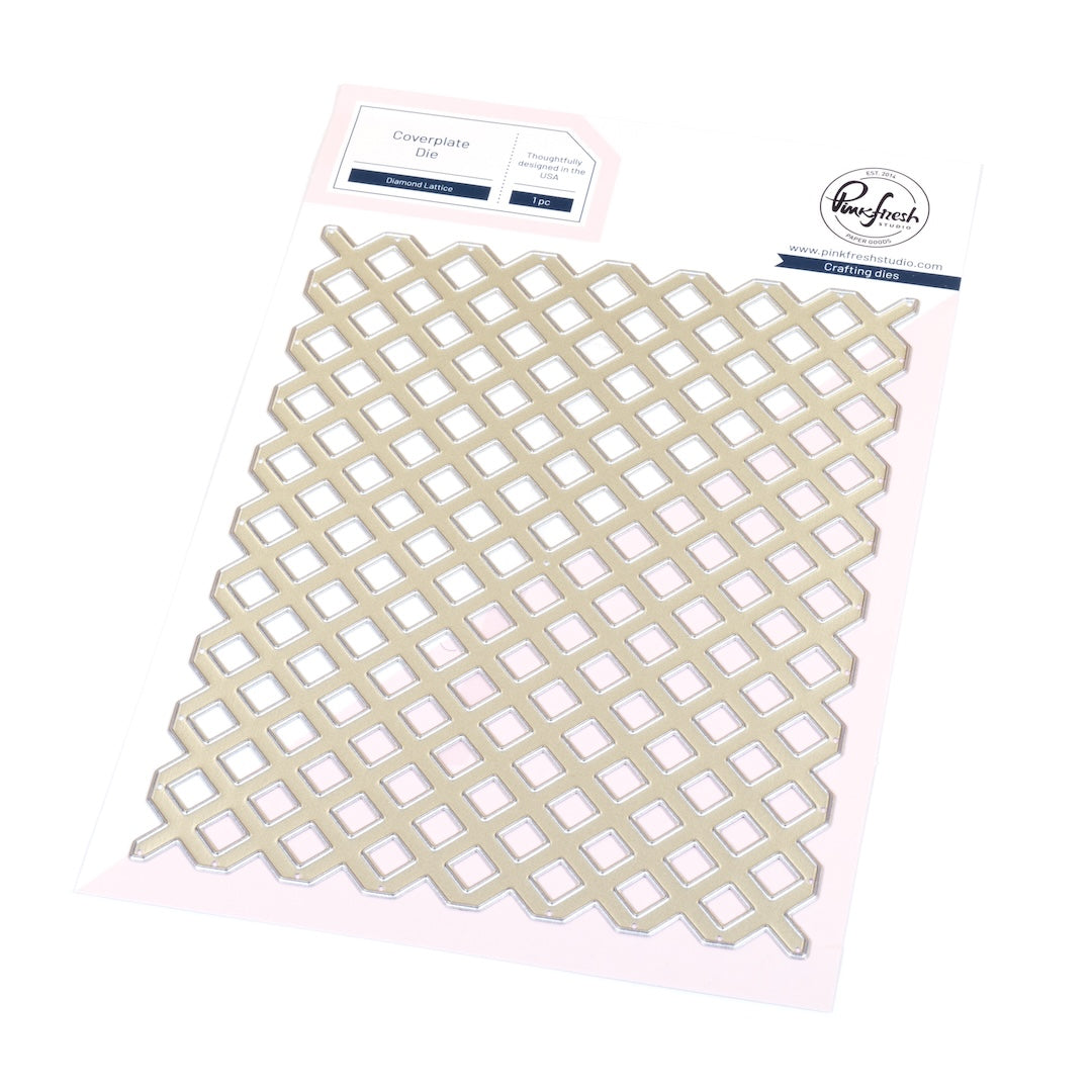
- Cut the Diamond Lattice from white cardstock. Trim it to 3 1/2" x 4 5/8".
- Adhere to the backside of the frame. Add thin foam adhesive around the perimeter; adhere to the card, centered.
- Die cut the THANKS letters twice from white card stock. Ink blend one set of them with Waterfall on the top, blending into Paradise at the bottoms of the letters. Stack each letter on a blank, and adhere to the lattice using foam tape.
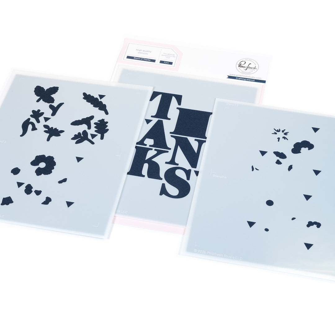
- Stencil the flowers using the following colors:
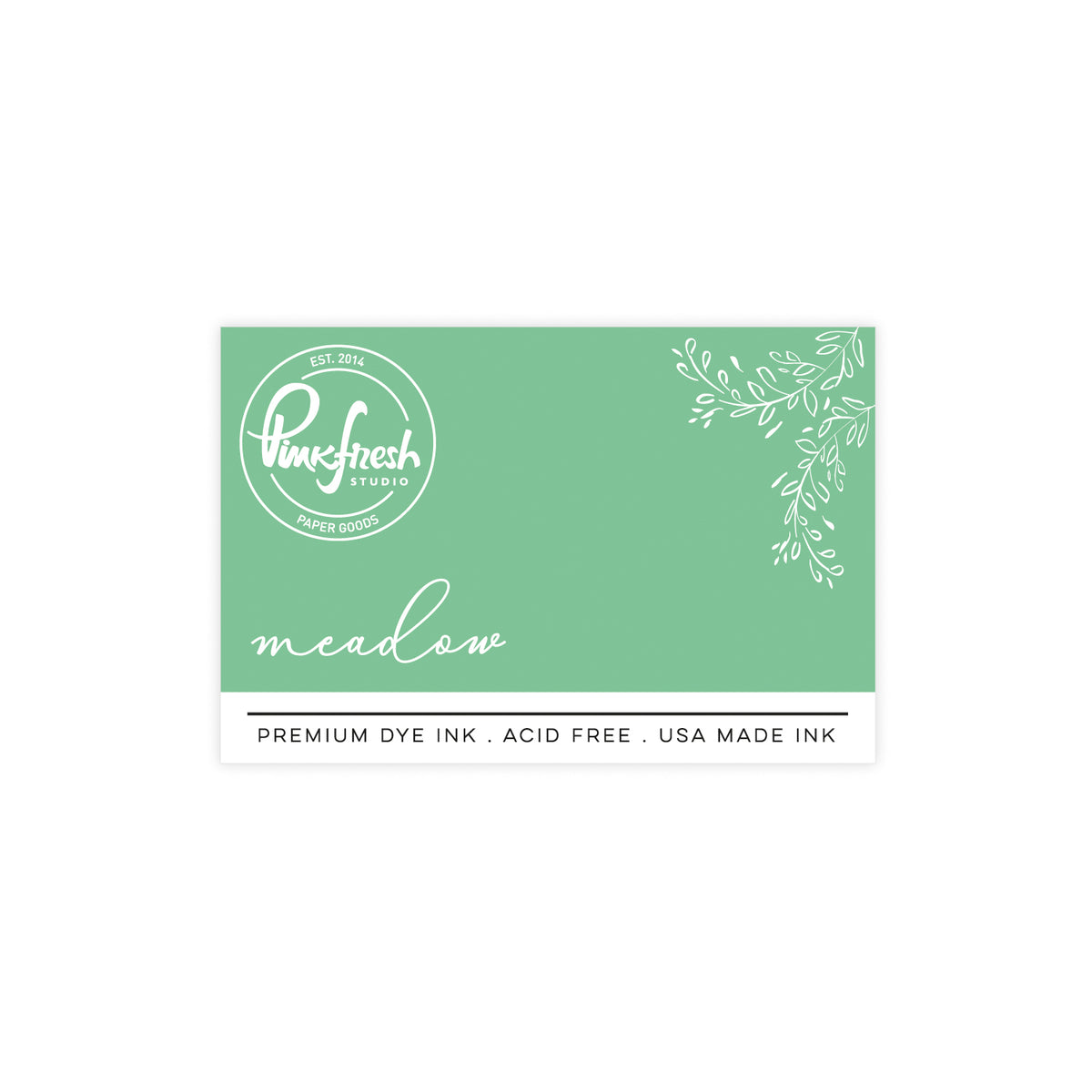
- Stencil 1: Mint, Meadow
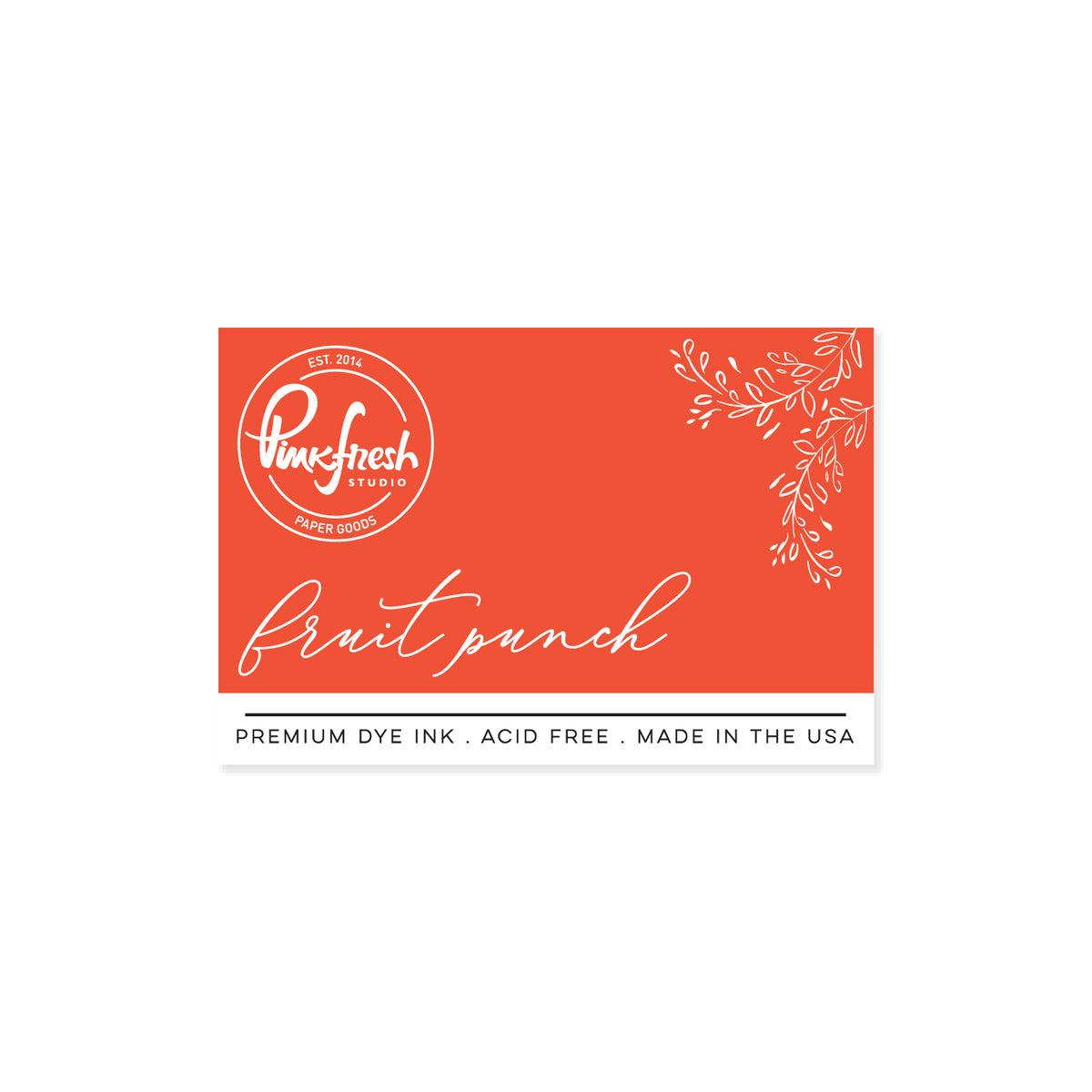
- Stencil 2: Mango Sorbet, Fruit Punch
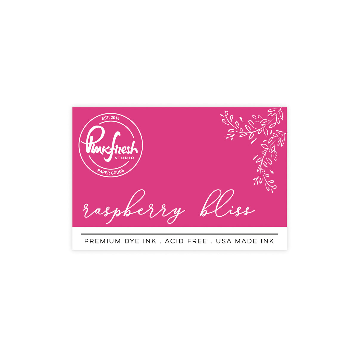
- Stencil 3: Sparkling Rose, Raspberry Bliss
- Stencil 4: Lemon Whip
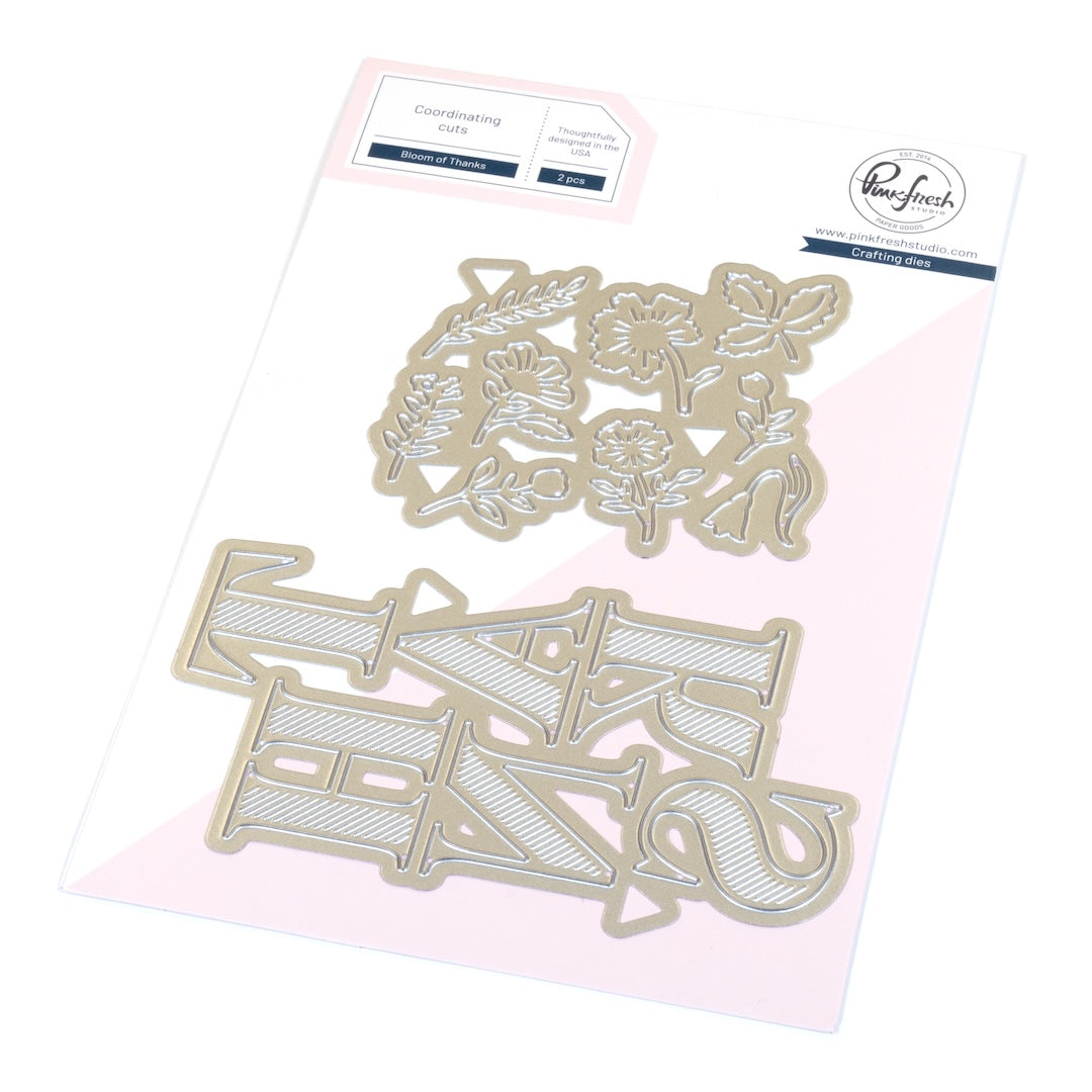
- Die cut the flowers with the coordinating die, and cut two additional sets of die cuts from white cardstock. Adhere the stenciled flowers to the blanks for extra sturdiness and dimension.
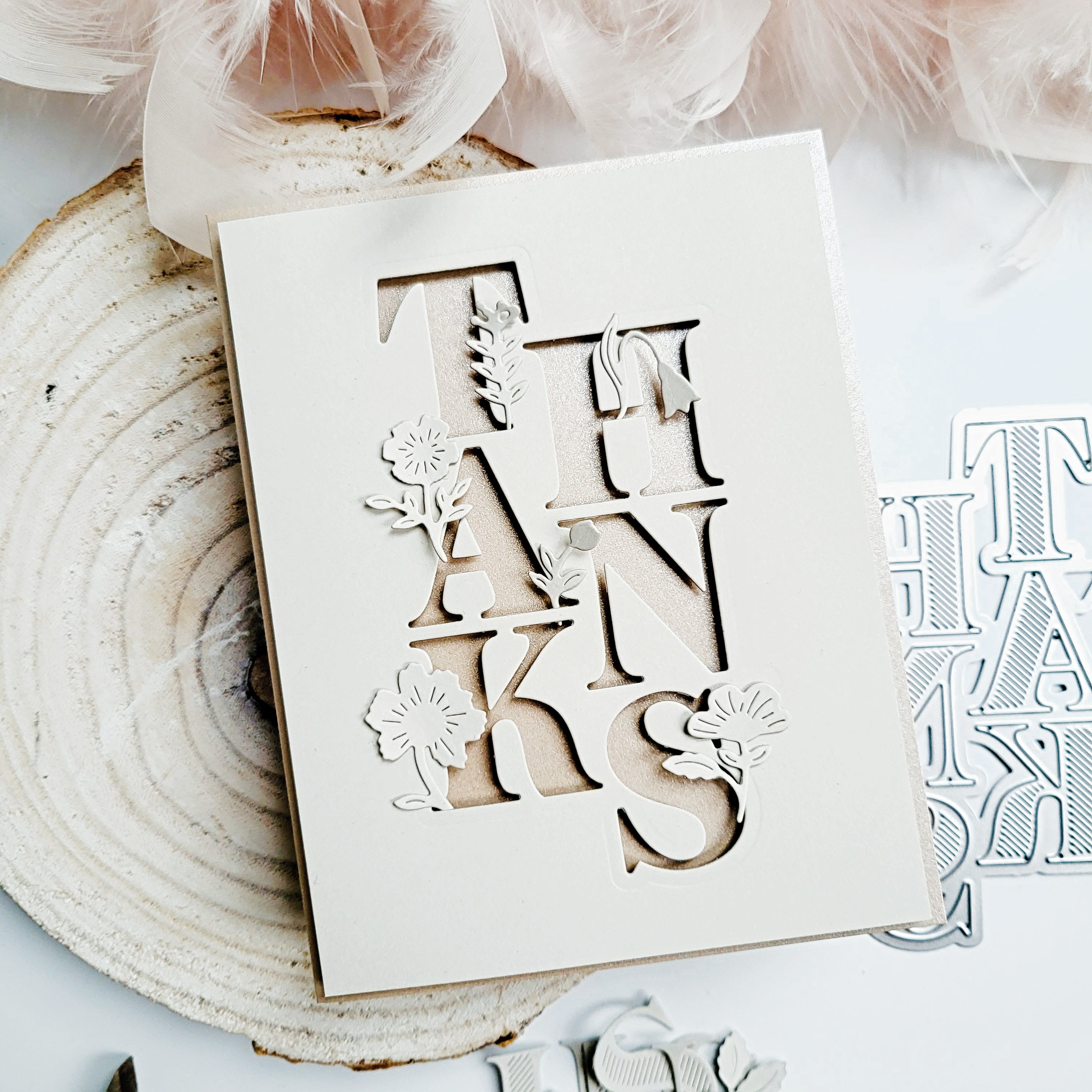
- Adhere the flowers strategically to the letters using liquid glue, following the letterform. See how on the H, the leaf covers the middle part of the H? And on the A, the bent tulip follows the angle of the opening area. On the K, each part of the leaf emulates the direction of the parts of the letter. On the S, the curved stem follows the curve of the letter. On the N, the thin flower fits perfectly along the final stroke of the letter. The T was the loosest coverage, but I rolled with it. I centered the flower on the thickest part of the letter.


I hope this tutorial inspires you to experiment with alignment and flow in your own designs! I’d love to see your take on this technique—tag us on Instagram or share your project in the comments, along with your favorite design element or any questions you have.
You can also adapt this technique using different word dies—like “LOVE,” “JOY,” or “HELLO”—arranging the florals to follow each letter’s shape. For simpler versions, reduce the layers and focus on color placement; for more advanced depth, double-stack your die cuts or shadow the letters with vellum for subtle dimension. No matter your approach, aligning organic shapes with geometric structure adds a polished, professional finish every time.
Recommended Products






















1 comment
Sue Crease
Just beautiful xx
Leave a comment
All comments are moderated before being published.
This site is protected by hCaptcha and the hCaptcha Privacy Policy and Terms of Service apply.