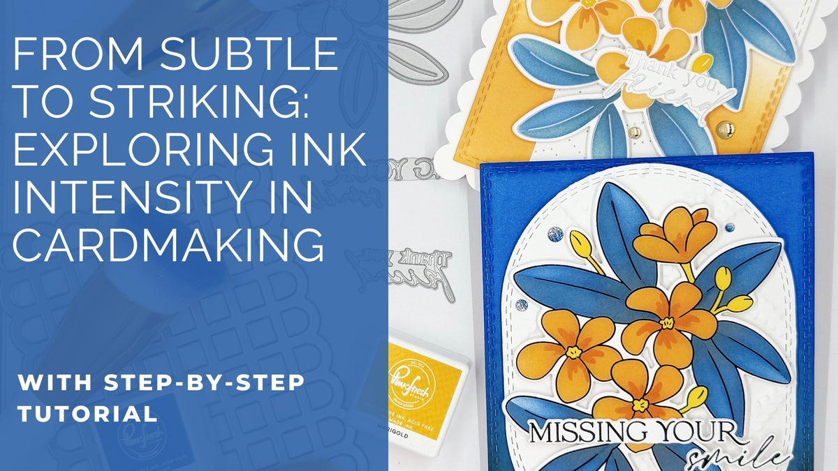
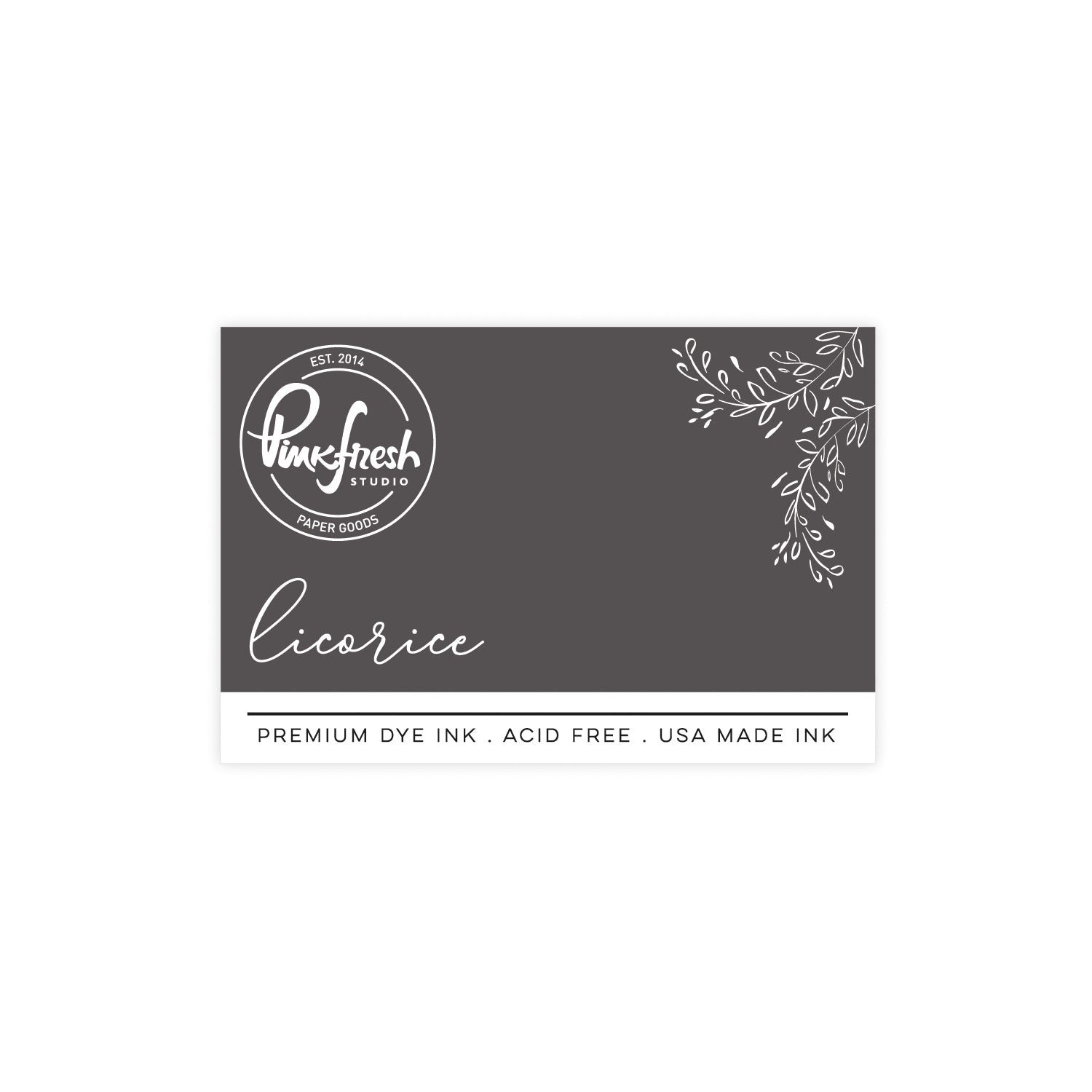
One of my favorite ways to stretch supplies and spark creativity is by exploring how different techniques can completely transform the mood of a card, even when using the exact same color palette. In today’s post, I’m sharing two handmade cards that prove just how powerful your ink choices can be.
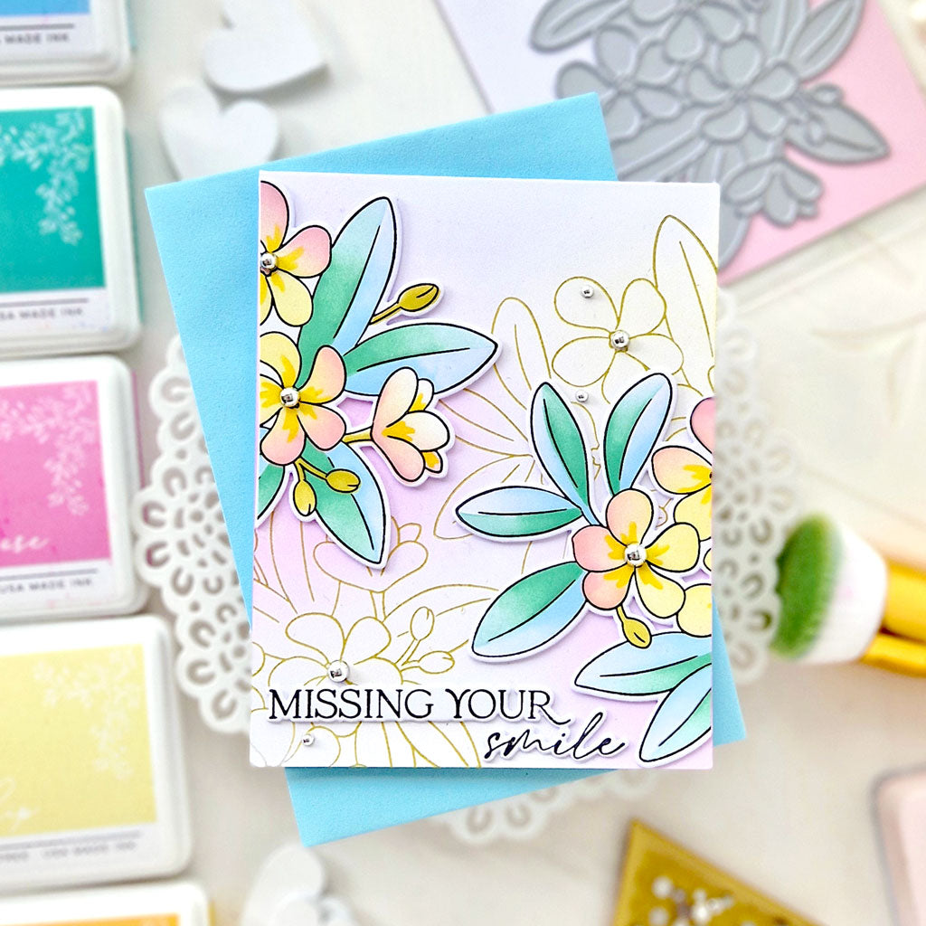
Both cards were created with the same set of Pinkfresh Studio premium dye inks. However, here’s where things get exciting: one design leans into a soft, ethereal blend for a light and delicate finish, while the other embraces bold saturation and crisp contrast for a high-impact result.
This side-by-side comparison highlights how ink intensity, blending pressure, and layering techniques can shift your card from subtle to striking—without changing a single color. Whether you're in the mood for gentle elegance or vibrant energy, your ink pads can do it all. Let’s take a closer look at how these two very different cards came to life from the same foundation.
*Disclaimer: All products used are linked below as clickable images. If a product isn’t listed, it’s been discontinued.

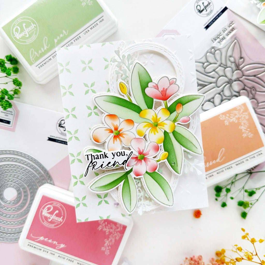
How to recreate this card:
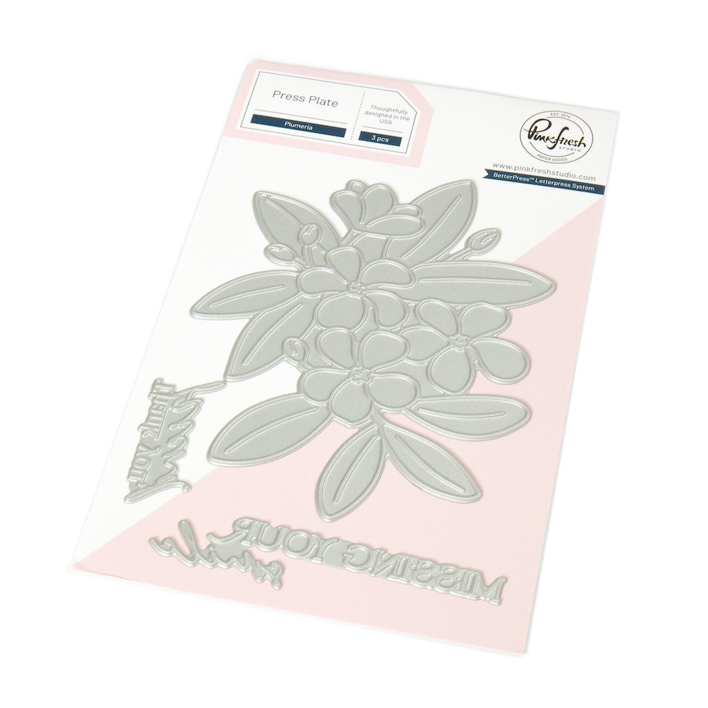
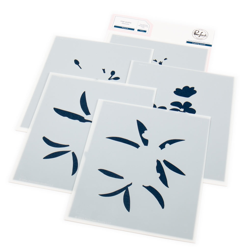
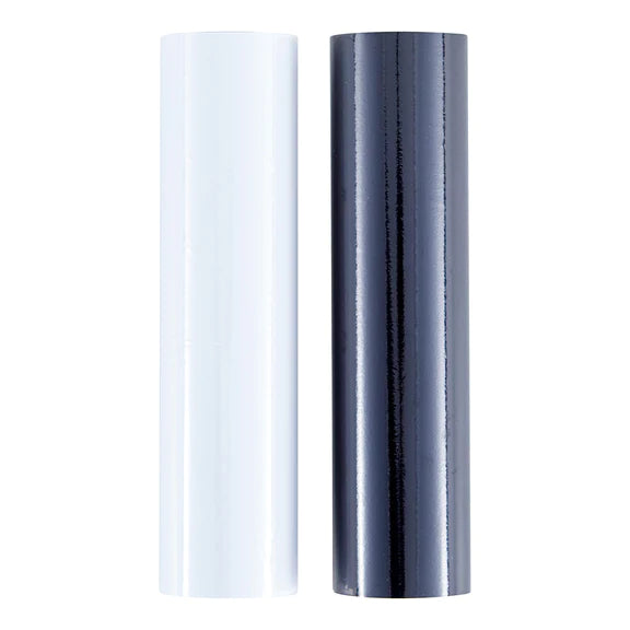
- Hot foil the Plumeria in opaque white. Add color using the coordinating stencils:
- Stencil 1: Blue Jay, Storm
- Stencil 2: Blue Jay, Storm, Black Licorice
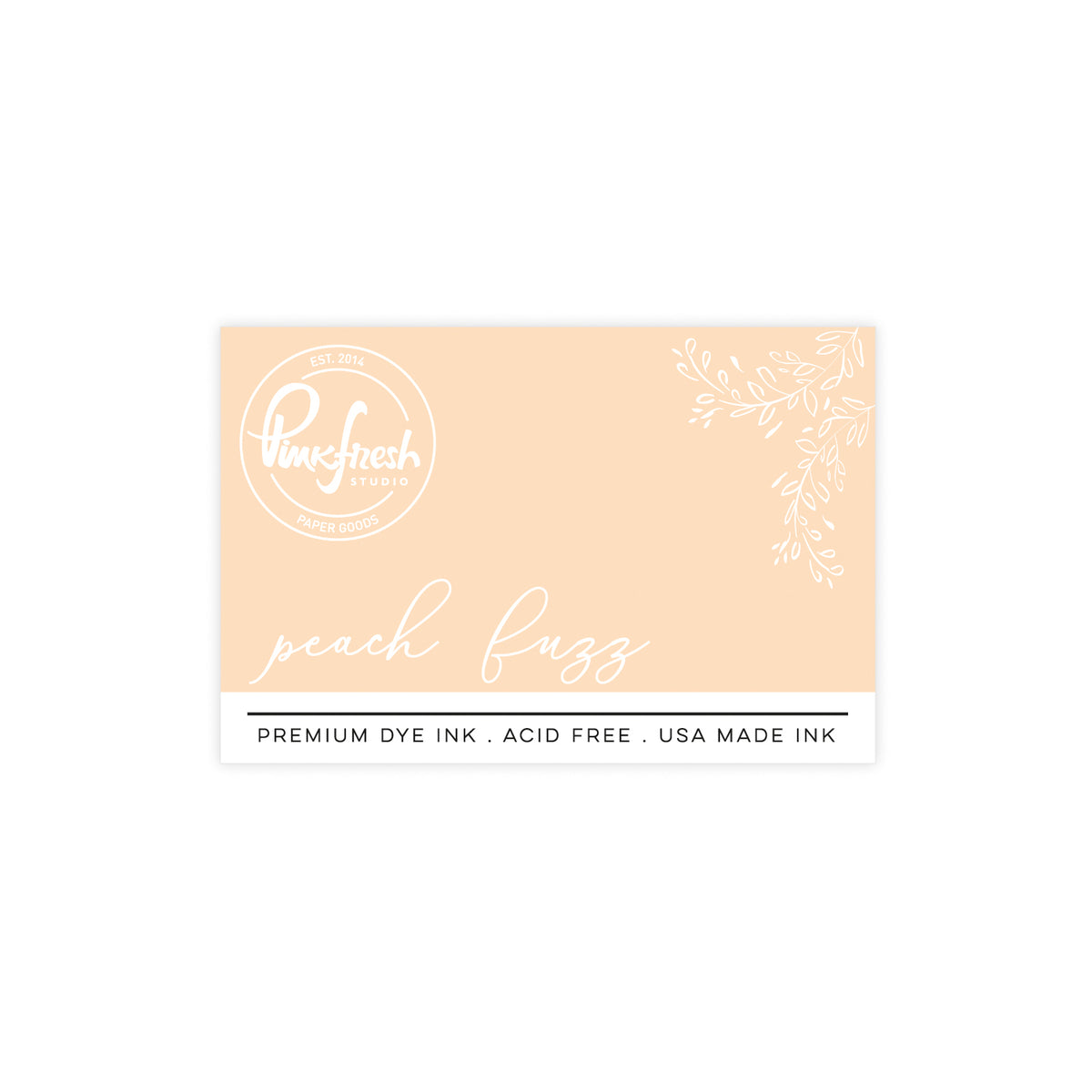
- Stencil 3: Peach Fuzz, Apricot
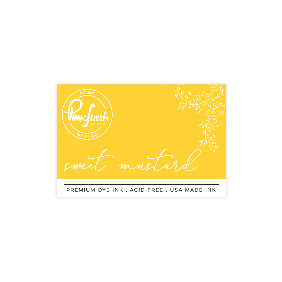
- Stencil 4: Sweet Mustard, Marigold
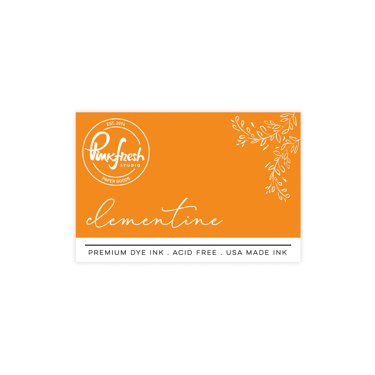
- Stencil 5: Clementine
- Hot foil the sentiment in satin pewter.
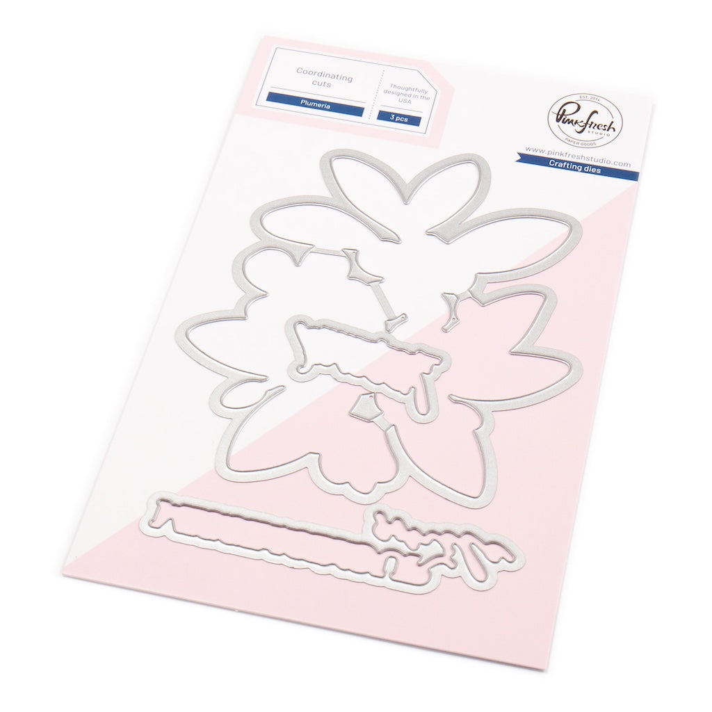
- Die cut the flowers and sentiment, and stack both with a blank die cut.
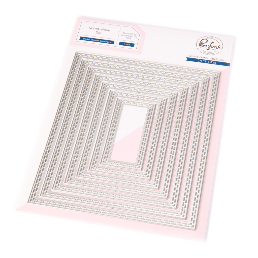
- Die cut a white panel with the second-largest die in the Essentials: Double Stitched Rectangles die. Ink blend using Apricot about halfway up the panel, fading out the color as you get higher.
- Cut a piece of white cardstock to 1 ¾” x 5” and “cut” using the Dotted Chevron coverplate die (center the design). Adhere to the center of the ink-blended panel.
- Adhere the Plumeria to the center of the panel with foam tape.
- Adhere the sentiment on the Plumeria.
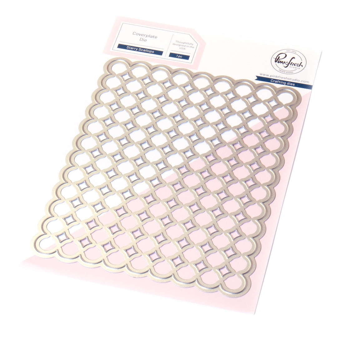
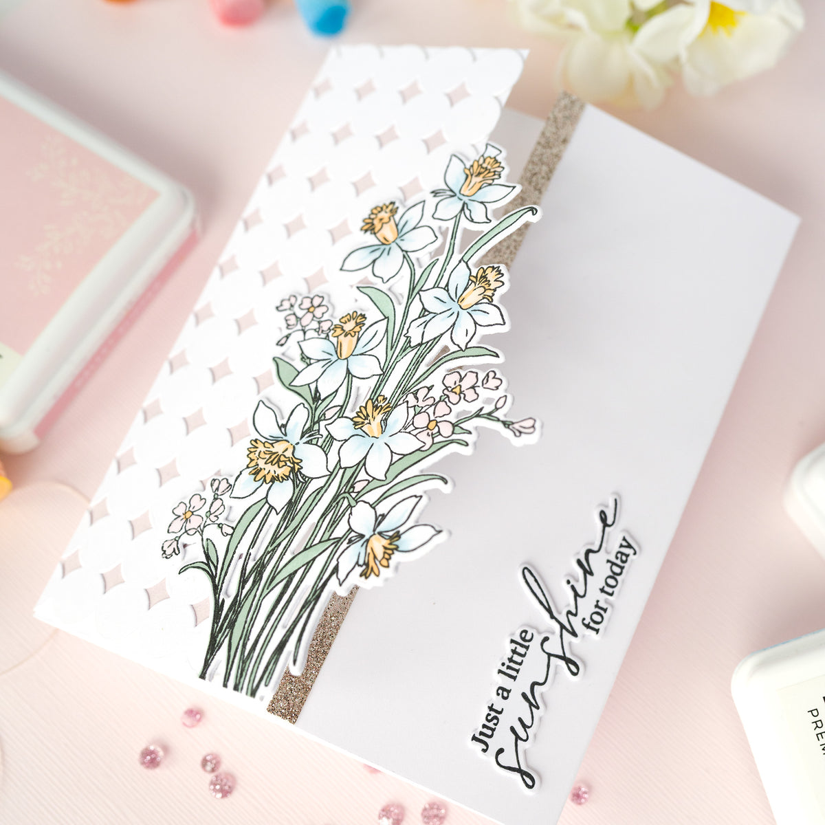
- Die cut the Starry Scallops coverplate from white cardstock.
- Cut a piece of white cardstock to 3 ¾” x 10”; score at 5” to create a smaller card.
- Adhere the folded notecard to the back side of the Starry Scallops coverplate die cut.
- Adhere the decorated panel to the center of the other side of the Starry Scallops coverplate die cut using foam tape.
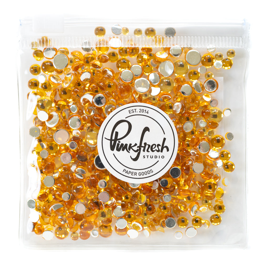
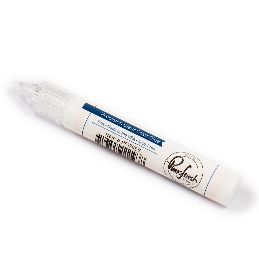
- Adhere Amber Clear Drops using Precision Clear Craft Glue.


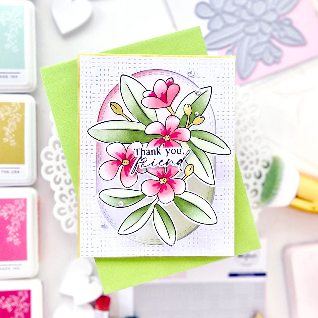
Now, let's get dramatic with the bold version!

- Hot foil the Plumeria in opaque black. Add color using the coordinating stencils:
- Stencil 1: Blue Jay, Storm
- Stencil 2: Blue Jay, Storm, Black Licorice
- Stencil 3: Peach Fuzz, Apricot, Clementine
- Stencil 4: Sweet Mustard, Marigold
- Stencil 5: Clementine
- Hot foil the sentiment in opaque black.
- Die cut the flowers and sentiment, and stack both with a blank die cut.
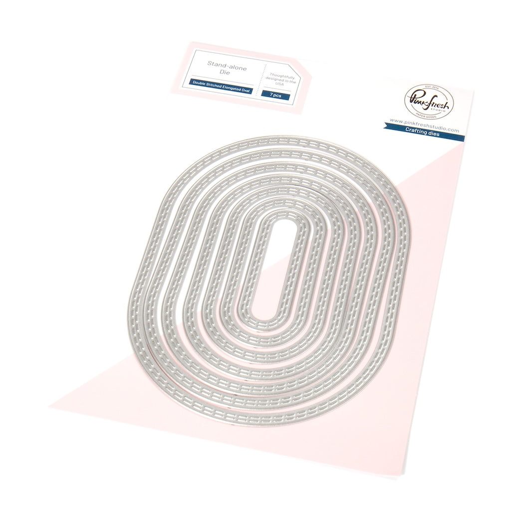
- Die cut a white panel with the largest die in the Essentials: Double Stitched Elongated Ovals die.
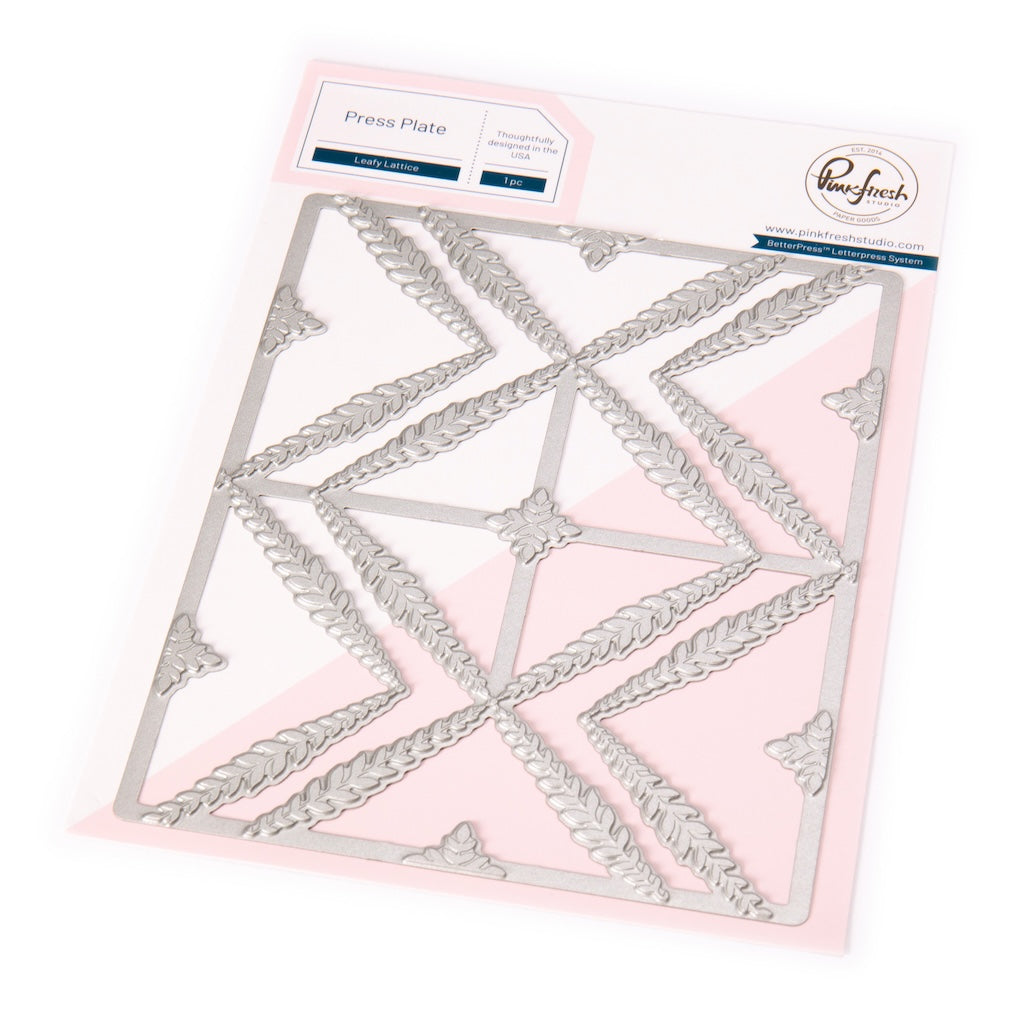
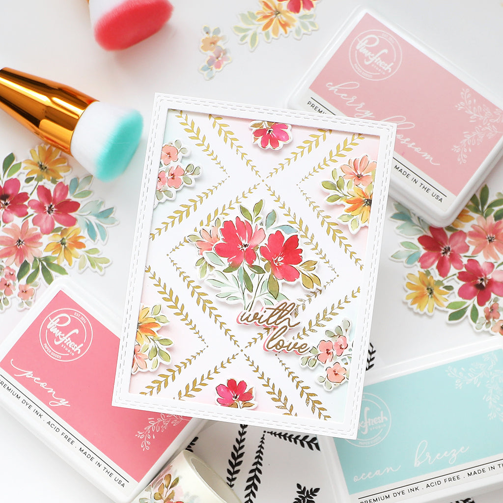
- Dry emboss it with the Leafy Lattice press plate using a rubber embossing mat.
- Die cut a white panel with the largest die in the Essentials: Double Stitched Rectangles die. Ink blend using Blue Jay on the top third, fade into Storm on the rest, then go over Stom with Licorice on the bottom third to deepen the shade.
- Cut and fold an A2 top-folding card base from white cardstock.
- Adhere it to the card base with liquid glue.
- Adhere the flower to the oval panel with foam tape, and the sentiment to the flower with liquid glue.
- Adhere the decorated panel to the card base using foam tape.
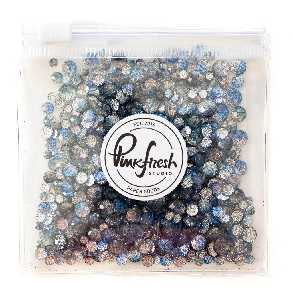
- Adhere Starry Sky Ombre Glitter Drops using Precision Clear Craft Glue.
I’d love to see how you interpret this ink-versatility approach! Tag us on Instagram with your version of these cards, and let me know in the comments, do you prefer the soft look or the bold one?
Recommended Products



































1 comment
Mariette
Leave a comment
All comments are moderated before being published.
This site is protected by hCaptcha and the hCaptcha Privacy Policy and Terms of Service apply.