
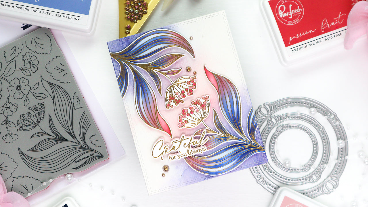
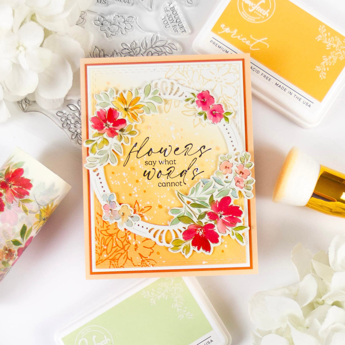
Hello crafty friends! Hope you’re having a great week so far! It’s TaeEun here today, sharing a thank-you card featuring some gorgeous new products from the March Joyful Blooms Release—going live on Tuesday, March 11!
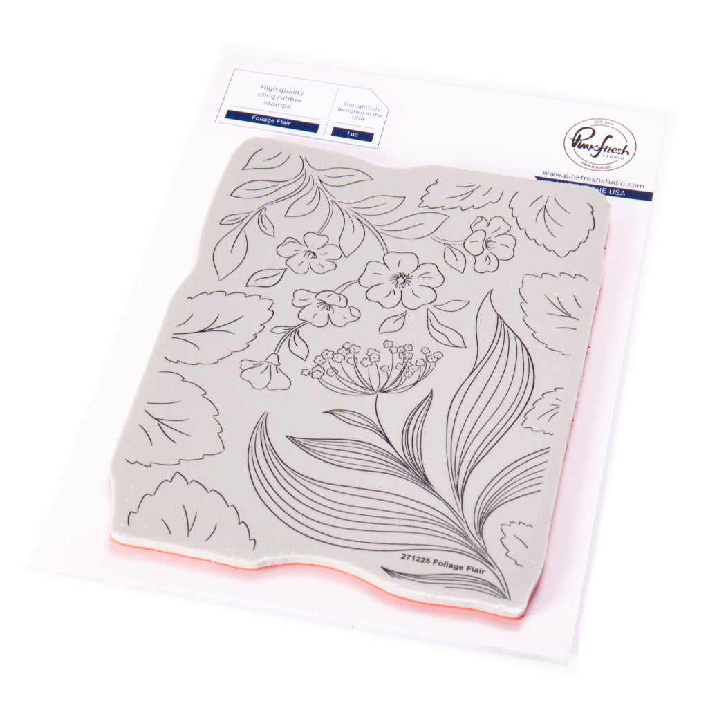
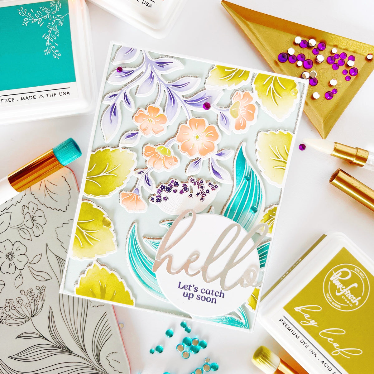
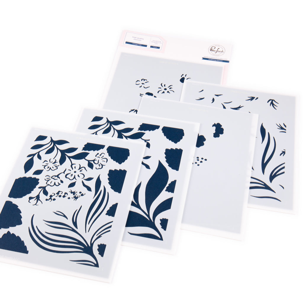
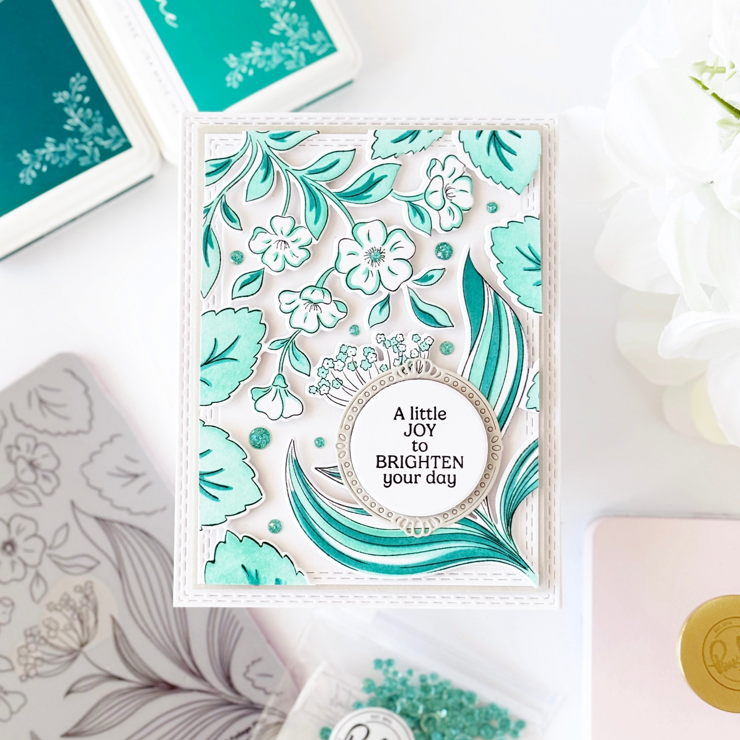
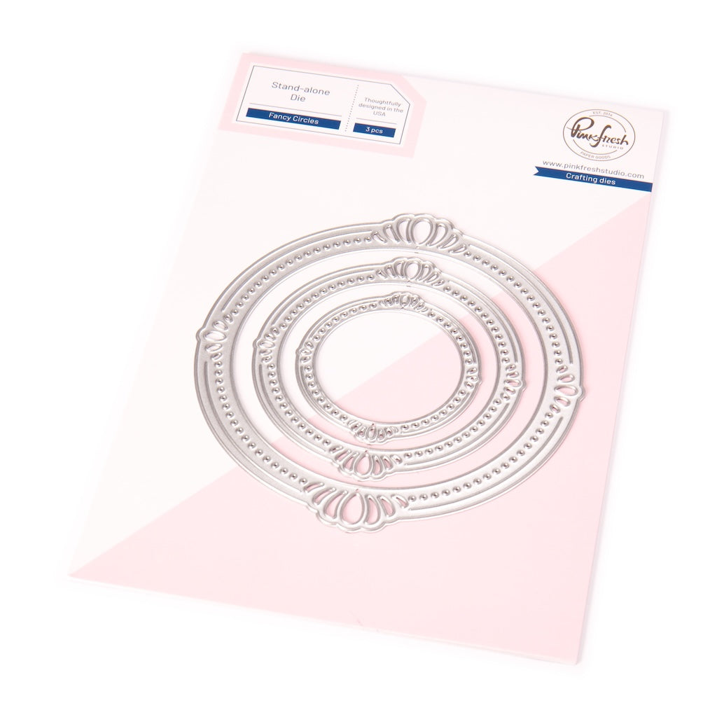
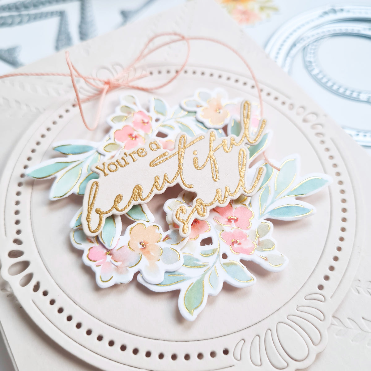
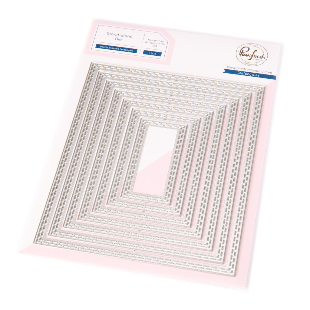
This release includes three stunning washi suites with four washi tapes, along with unique designs like the Foliage Flair suite, which I’ll be showcasing in today’s project. To bring everything together, I also used two Eessentials die sets from the new release —Elegant Circles and Double Stitched Rectangles—to add texture and structure to my design.
For this card, I wanted to create a smooth, flowing color transition from royal blue to coral pink and back to royal blue, ensuring that both the focal images and the background were seamlessly connected.
* Disclaimer: All products used are linked below as clickable images. If a product isn’t listed, it’s been discontinued. The new items will be listed as of the release date.

Here’s how I made this card:
- Heat emboss the Foliage Flair image twice in gold on white cardstock.
*For my card, I only used the section featuring the flower with large foliage. - Color both images using the coordinating stencils with the following ink combinations:
- Leaves (base): Slumber, Blue Jay and Stargazer
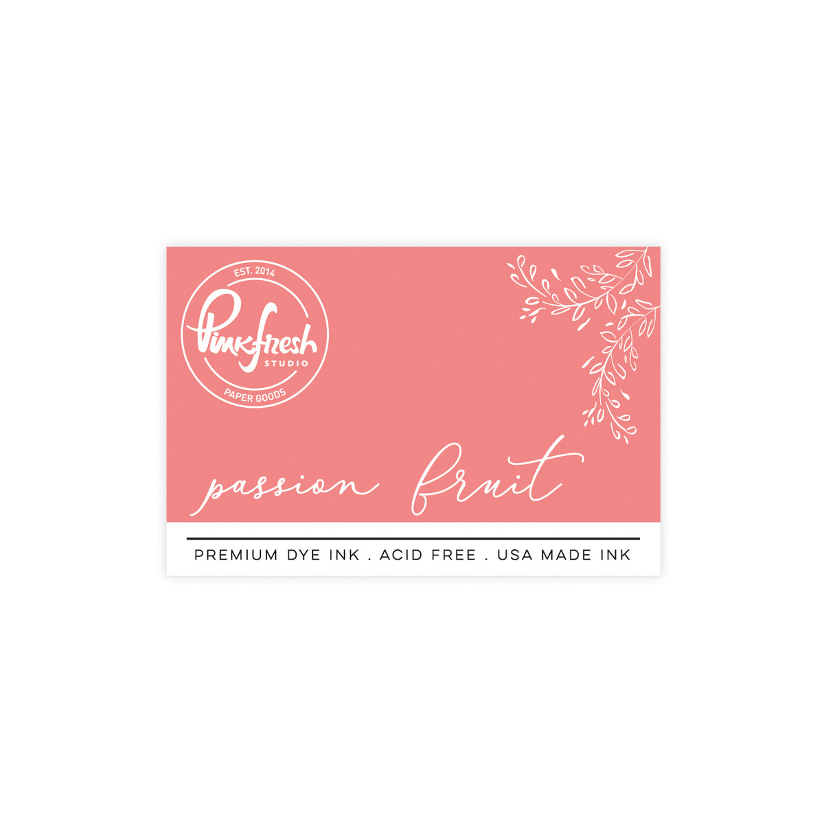
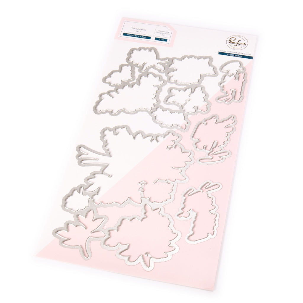
- Leaves (tips) and flowers: Cherry Blossom, Coral Reef and Passion Fruit - Die cut the images using the coordinating die.
- Create the background panel
- Ink blend two diagonal corners of a mixed media panel in Stargazer and Slumber and the center in Coral Reef and Cherry Blossom to mirror the focal image’s colors.
- Lightly spritz water over the panel for a watercolor effect and let it dry.
- Die-cut the panel using a die from the Double Stitched Rectangles set.
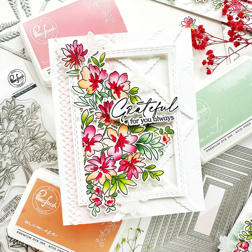
- Dry emboss the panel using two dies from the Elegant Circles die set to add subtle texture. - Adhere the background panel onto a white cardbase and foam mount the stenciled images onto the diagonal corners as shown in the picture.
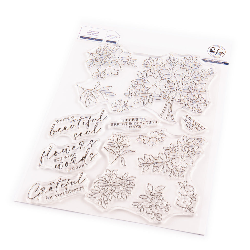
- Heat emboss the sentiment from the Flowers for the Soul Stamp set in gold and cut with the coordinating die, and cut a soft pink cardstock with the same die to create a slight offset mat behind the sentiment.
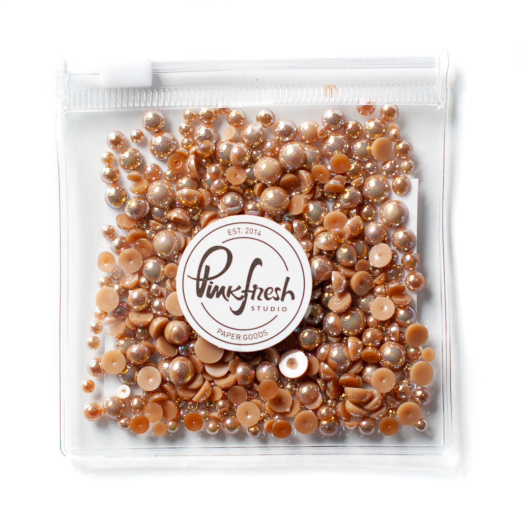
- Scatter some Sparkling Champagne Metallic Pearls for a finishing touch.

Before starting, I carefully planned the card layout to ensure a harmonious flow of colors between the background and the focal images. This approach gives the card a unified and elegant look, allowing the two large main elements to stand out without feeling overwhelming.
I hope this project inspires you to experiment with color balance and flow in your own cardmaking!
Mark your calendars for the exciting Blog Hop celebrating the upcoming release on Tuesday, March 11—you won’t want to miss it :) !
Thank you so much for stopping by!
TaeEun
Recommended Products




























Leave a comment
All comments are moderated before being published.
This site is protected by hCaptcha and the hCaptcha Privacy Policy and Terms of Service apply.