
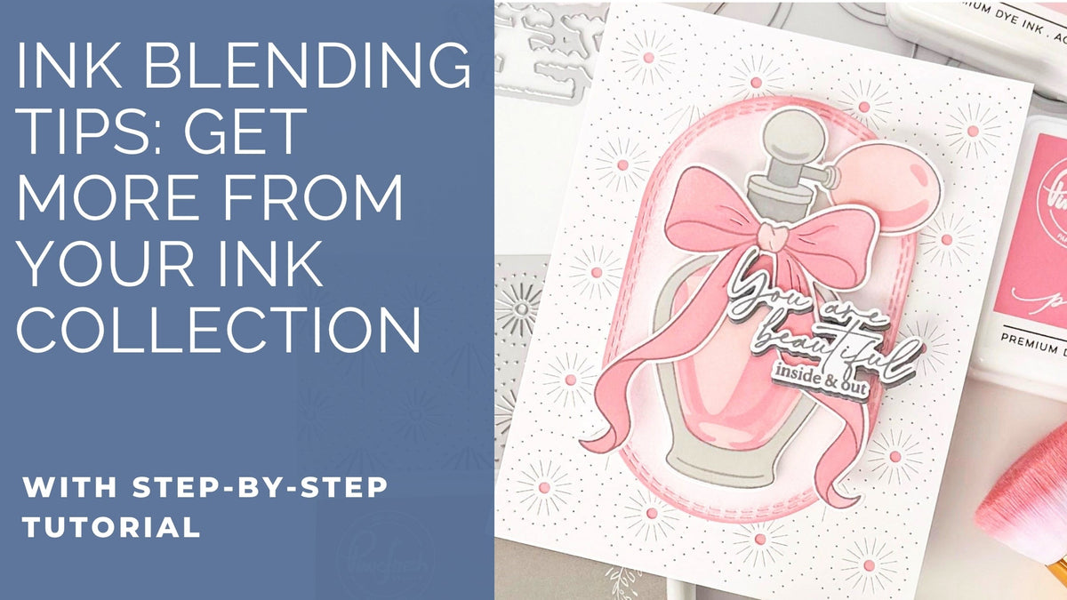
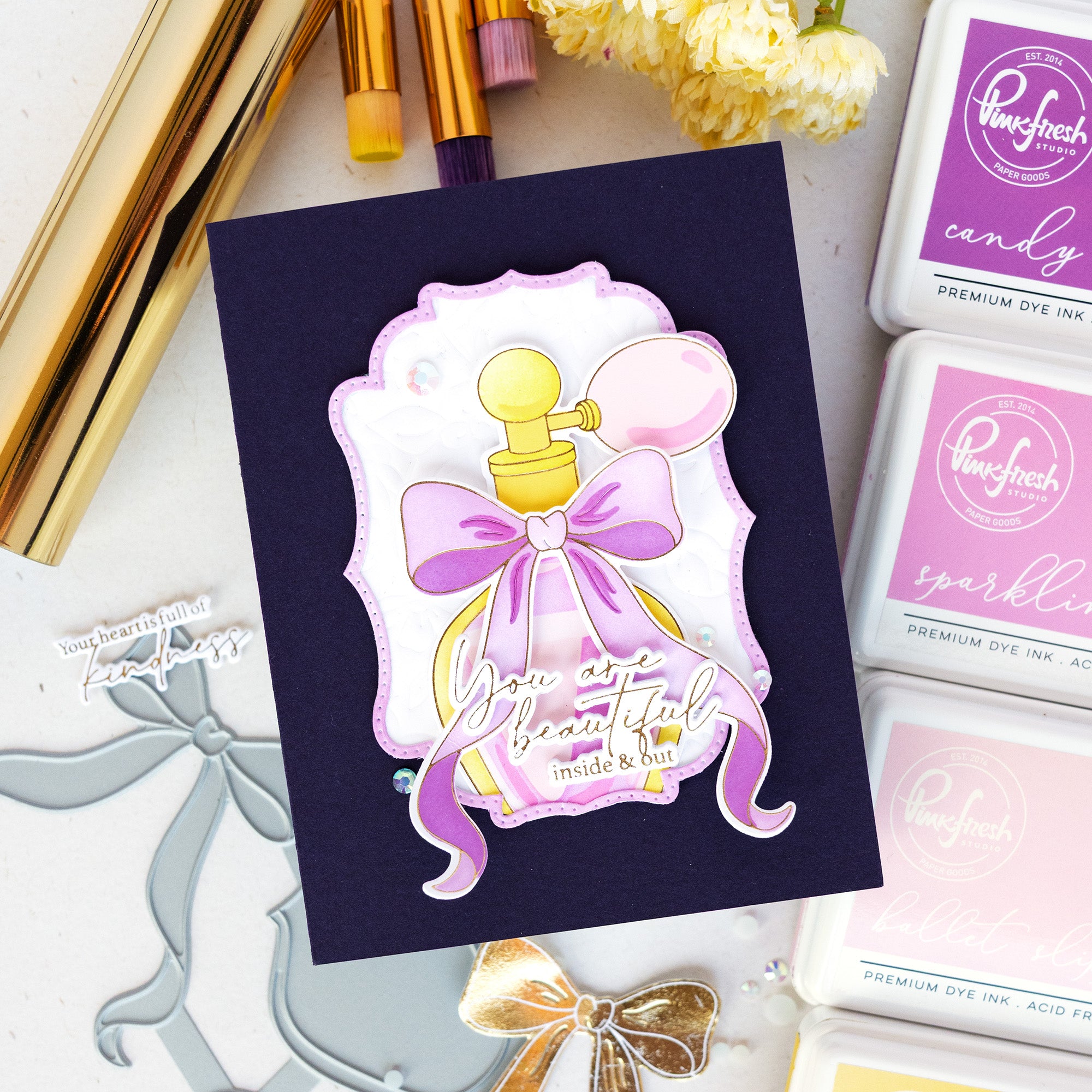
There is something timeless about soft pinks and delicate details. Today’s card combines graceful layering, subtle texture, and dimensional die cuts to create a design that feels polished and feminine while still remaining clean and modern.
For this design, the perfume bottle image becomes the star of the card front, accented with soft pink blending, dimensional layers, and the gorgeous Bloomlight Stitches coverplate background. The monochromatic pink palette mixed with warm gray tones creates a sophisticated color combination, while the layered sentiment adds depth and visual interest. Can you believe this was achieved with just two colors of pink ink? Changing the intensity of the application turned two colors into four, covering all four stencils with different shades. Don't have the whole color family? No problem!
*Disclaimer: All products used are linked below as clickable images. If a product isn't listed, it's been discontinued.

Step-by-Step Instructions
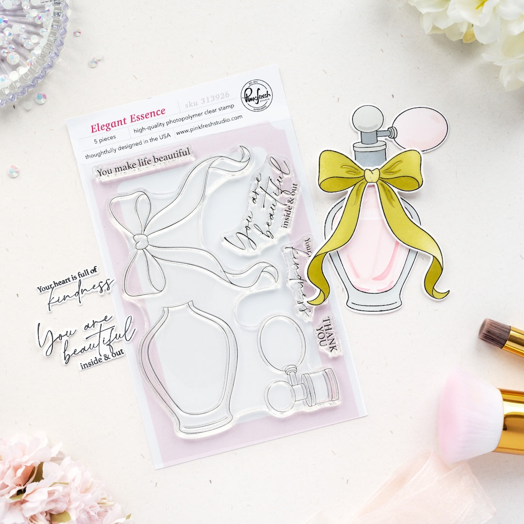
- Stamp the Elegant Essence image and the “You are…” sentiment onto white cardstock using Licorice ink.
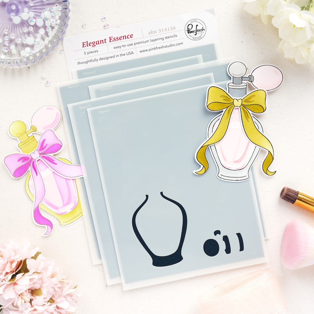
- Color the images using the coordinating stencils:
- Stencil 1: Misty Coast
- Stencil 2: Cherry Blossom (perfume bottle; light blend), Rocky Slope (perfume top)
- Stencil 3: Cherry Blossom (heavier blend)
- Stencils 4–5: Peony (lighter on stencil 4, heavier on stencil 5)
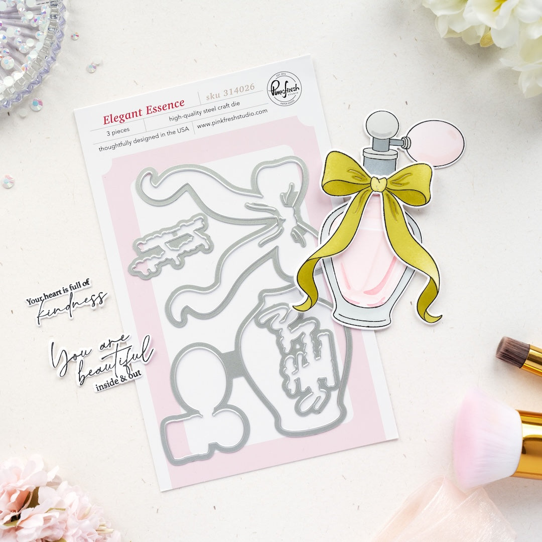
- Die cut the images and sentiment using the coordinating dies.
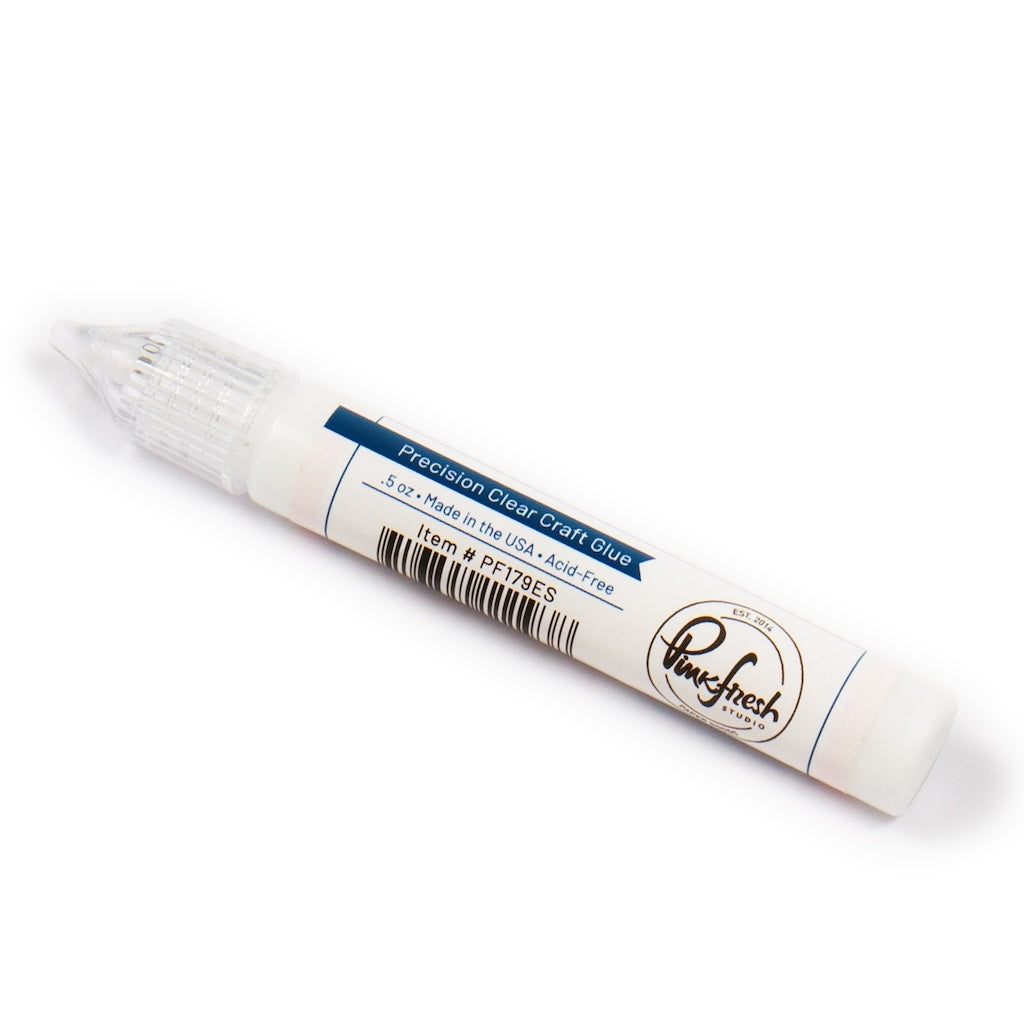
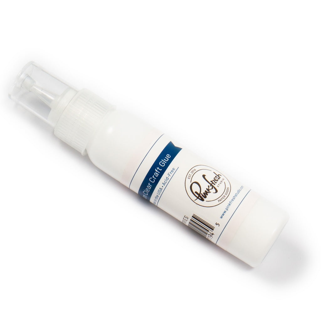
- Assemble the layered perfume bottle using liquid glue.
- Adhere the sentiment to the gray shadow die cut slightly offset for added dimension.
- Ink blend Peony ink around the edges of the card front, leaving the center area lighter.
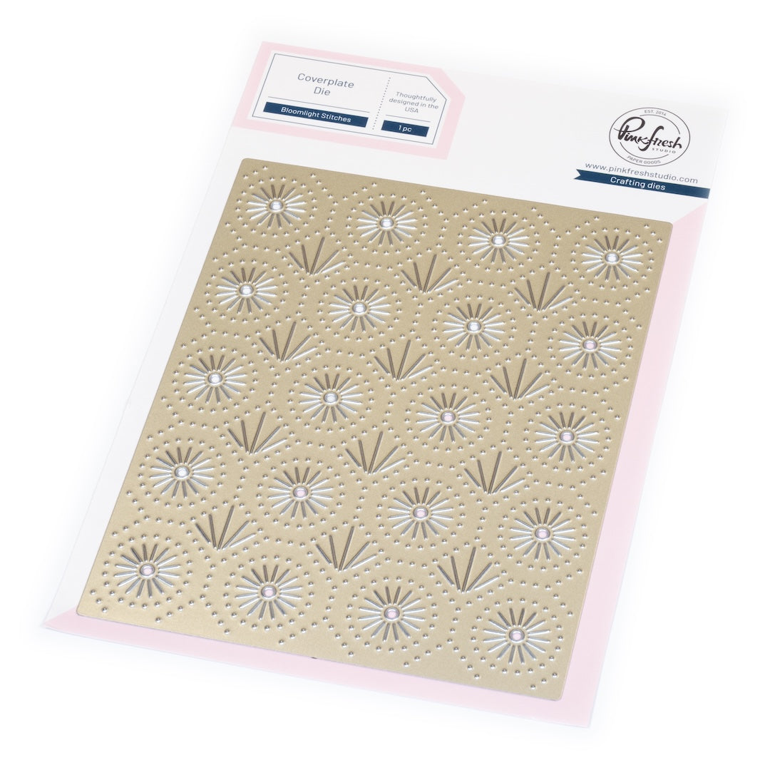
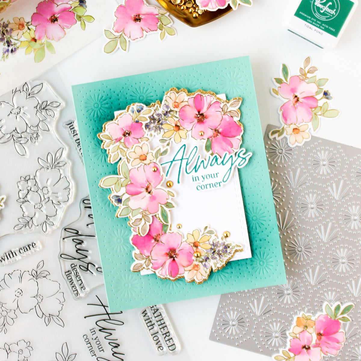
- Dry emboss the Bloomlight Stitches coverplate onto an A2 panel of white cardstock.
- Adhere the embossed panel to the card base using liquid glue.
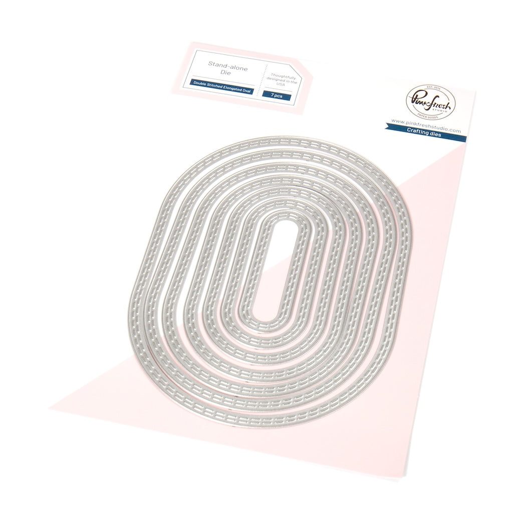
- Die cut the elongated oval from white cardstock.
- Ink blend Peony ink around the edges of the oval, fading softly toward the center.
- Adhere the oval to the center of the card using foam tape.
- Adhere the perfume bottle to the oval using foam tape.
- Adhere the sentiment to the perfume bottle using liquid glue.

Designer Tips
- Offset shadow layers behind sentiments for extra dimension and contrast.
- Keep the center of your ink blending lighter to naturally draw attention toward the focal image.
- Use varying pressure while stenciling to create soft highlights and realistic depth.
- A monochromatic color palette instantly creates a polished and elegant finished card.
I love how this card proves that you do not need a huge ink collection to create beautiful layered color and dimension. By using just two pink ink colors and varying the blending pressure, I was able to create four distinct shades of pink throughout the design. It is such a great way to stretch your supplies while still achieving a polished, professional look. Small details like the offset sentiment shadow layer and the softly blended oval help add depth while keeping the overall design clean and refined.
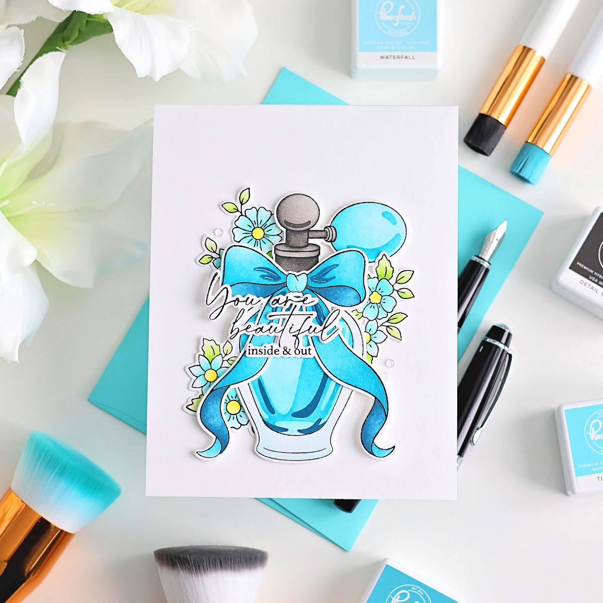
I hope this project inspires you to experiment with getting more versatility from the ink colors you already own. Try changing the color palette, adding metallic accents, or pairing these techniques with different focal images to create a completely new look.
If you recreate this card or try these ink blending techniques, I would love to see what you make! Be sure to tag Pinkfresh Studio on social media and share your beautiful creations.
Recommended Products























Leave a comment
All comments are moderated before being published.
This site is protected by hCaptcha and the hCaptcha Privacy Policy and Terms of Service apply.