
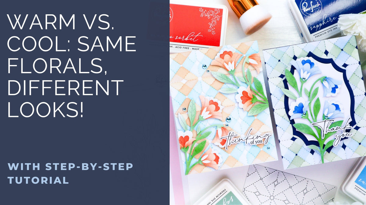
Hello everyone! I hope your week is off to a great start! It’s TaeEun here today with two cards featuring the Sweet Bloom and Heirloom Patchwork product suites from the Gather & Bloom Release.
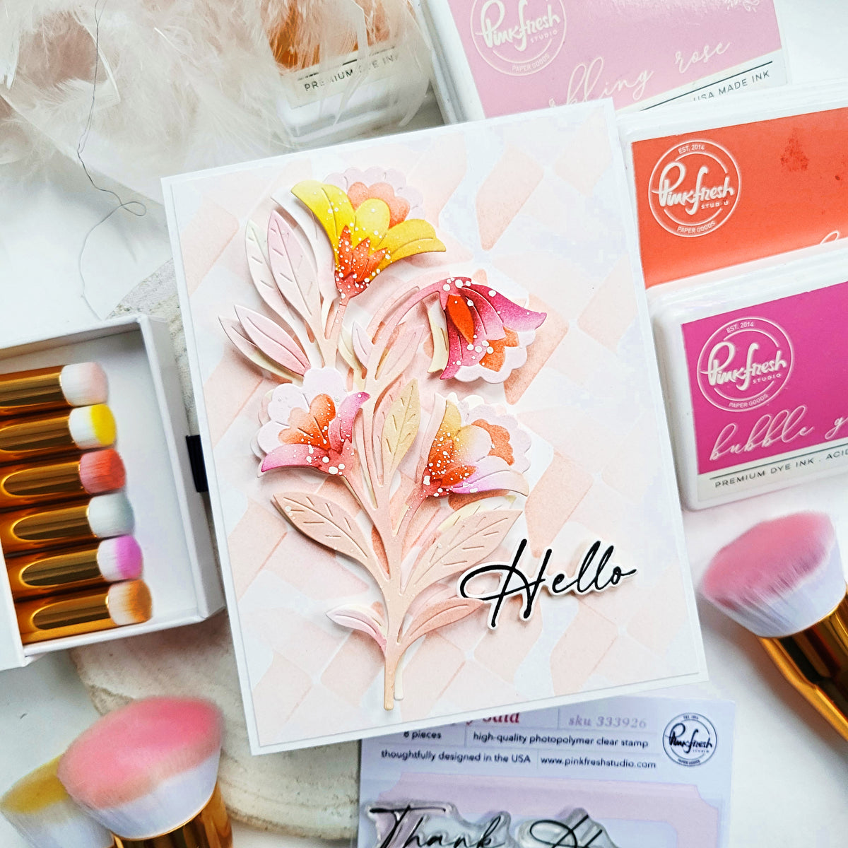
For today’s cards, I wanted to create two different tone-on-tone looks by coordinating the floral colors with the backgrounds; one in a warm palette and the other in a cool palette. I also left portions of the flower petals uncolored while stenciling, which adds contrast and gives the blooms a lighter, more dimensional look.
*Disclaimer: All products used are linked below as clickable images. If a product isn’t listed, it’s been discontinued.

Here is how I made the card.
- Stencil the Sweet Bloom image three times - two of the floral images in warm orange tones and the third in cool blue tones, while keeping the greenery the same throughout.
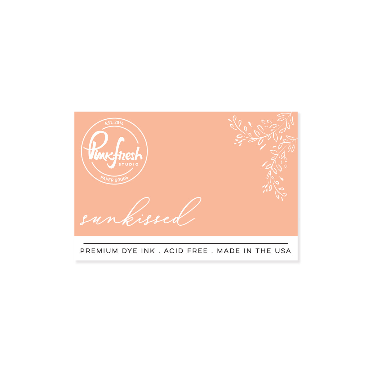
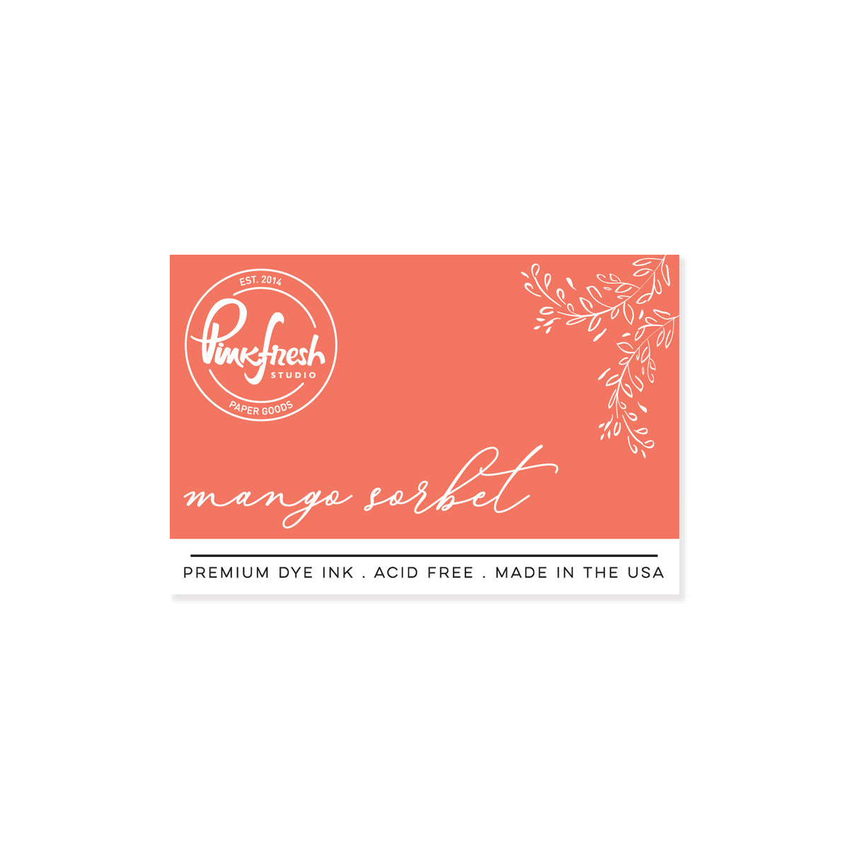
- Warm orange flowers: Peach Fuzz, Sunkissed, Mango Sorbet
- Cool blue flowers: Summer Shower, Slumber, Sapphire
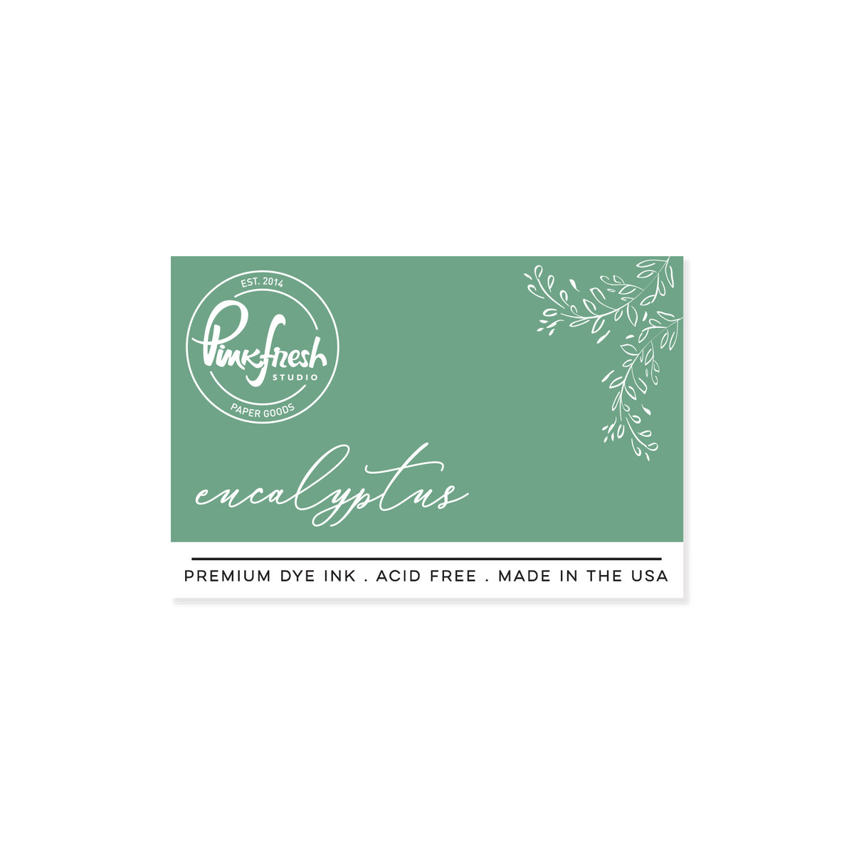
- Greenery: Sage, Eucalyptus, Olive
- For the flowers, lightly ink Stencil 1 with the lightest color and use the darkest shade for Stencil 2, leaving the base petals uncolored, then add the medium shade with Stencil 3.
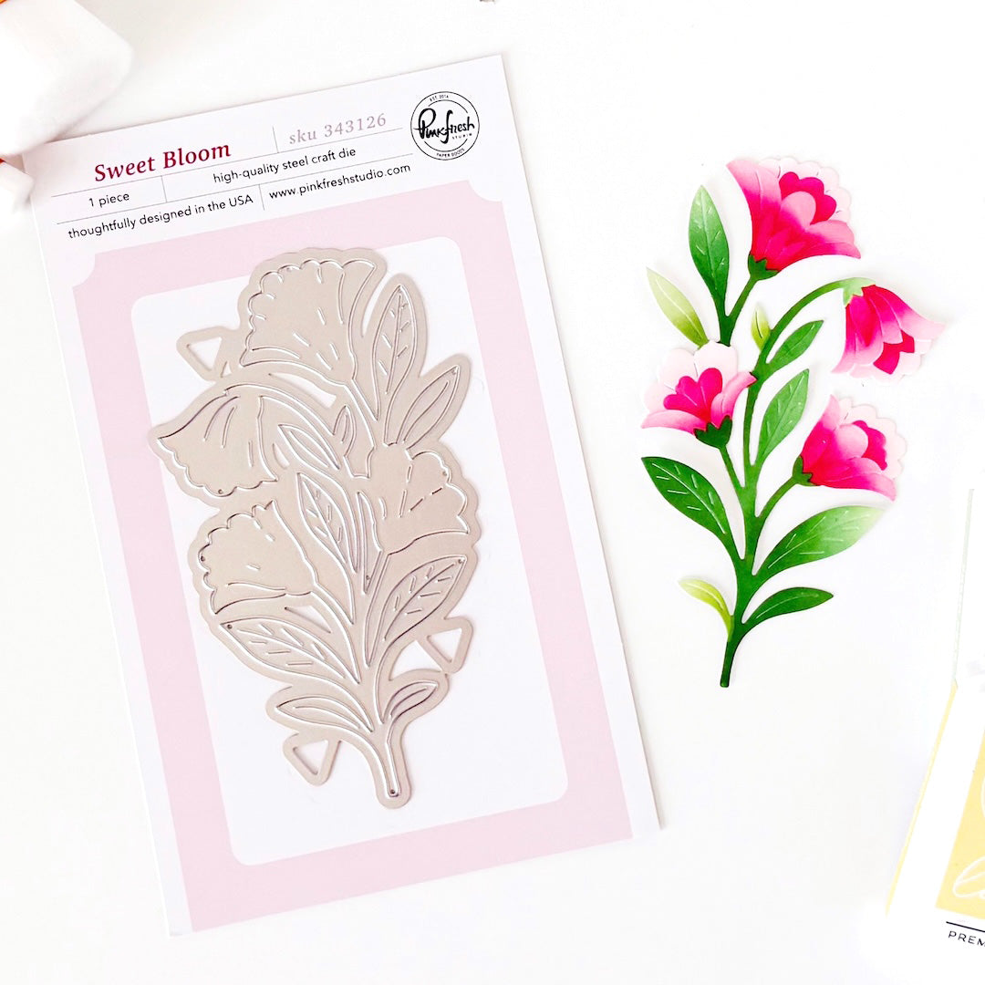
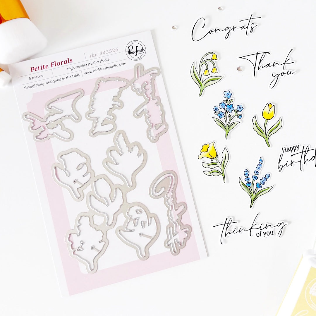
- Die cut all the Sweet Bloom images using the coordinating die and set them aside.
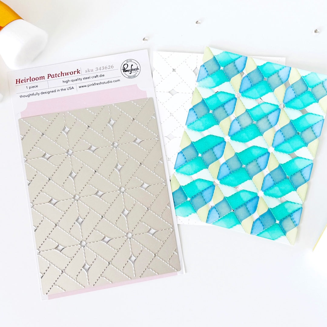
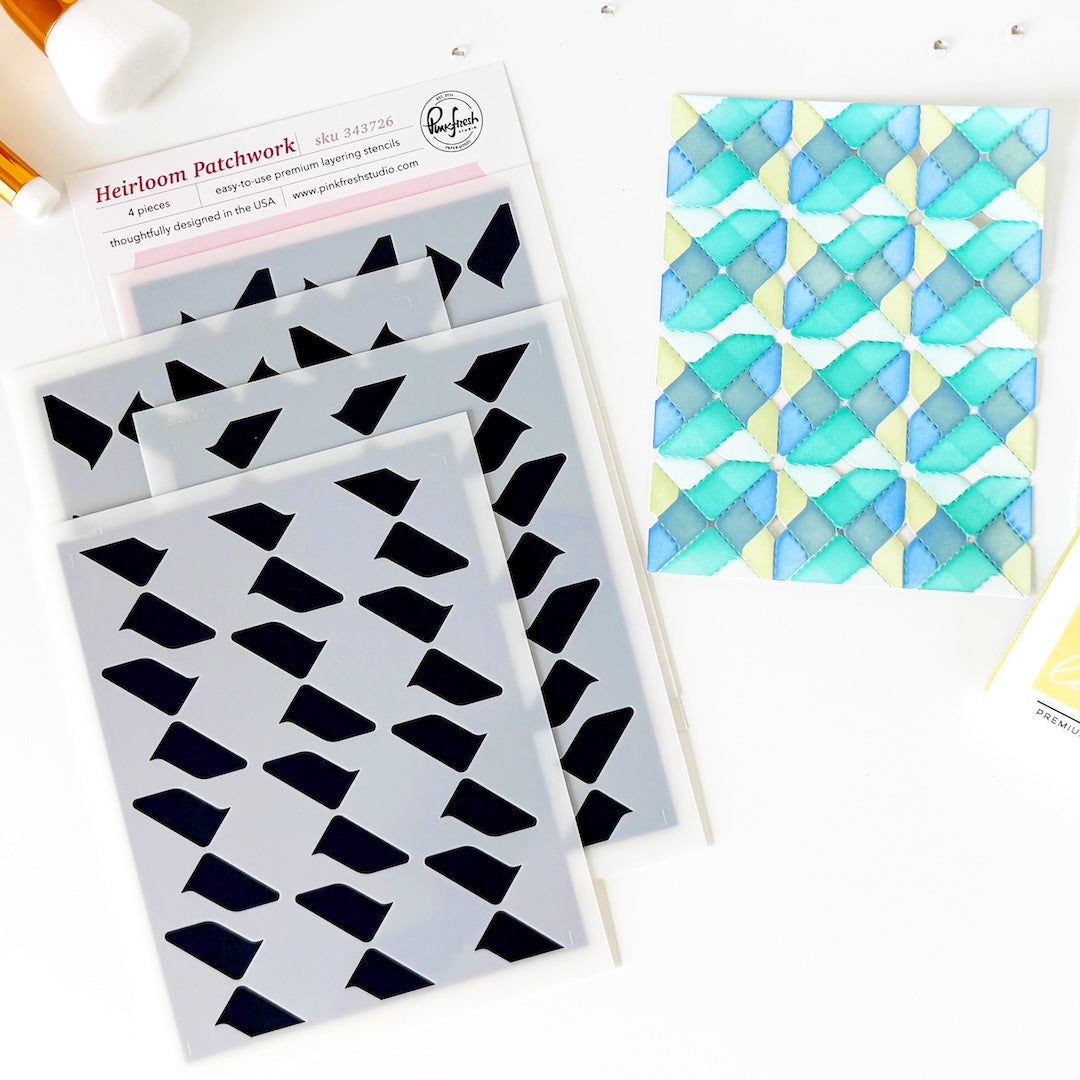
- Die cut two white panels with the Heirloom Patchwork die, then stencil them with the coordinating stencil set in the following colors.
- For the warm floral card: Sky Blue, Waterfall, Warm Buff, Peach Fuzz.
- For the cool floral card: Sky Blue, Slumber, Fresh Pear, Sage - switching the blue and green shades across the diagonal sections. - Assemble the warm-toned card.
- Adhere the blue and brown patchwork panel to a white cardbase.
- Foam mount two orange Sweet Bloom images diagonally across the card, and trim away the excess extending beyond the edges.
- Assemble the cool-toned card.
- Adhere the green and blue patchwork panel to a navy cardbase.
- Die cut a larger Heirloom Nested Frame from navy cardstock and a smaller one from white cardstock.
- Layer the two Heirloom Nested Frame panels and add them to the center of the card.
- Foam mount the blue Sweet Bloom image on top.
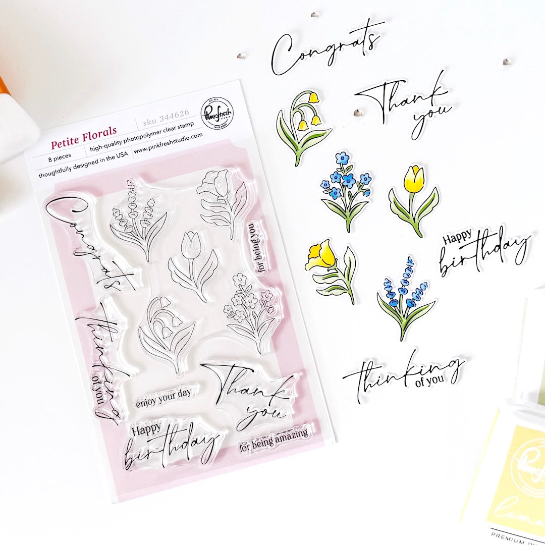
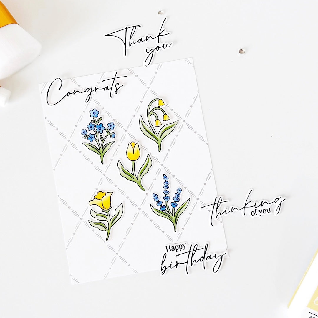
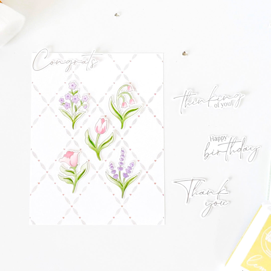
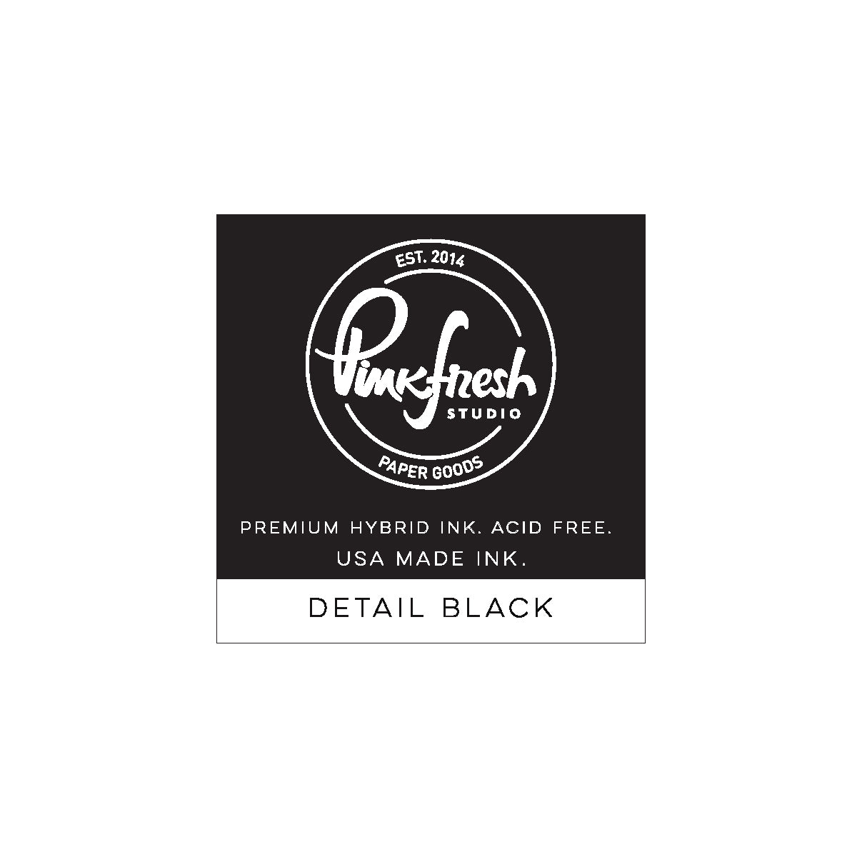
- Stamp the sentiments from the Petite Florals stamp set in Detail Black, die cut them, and stack each sentiment with three additional die cuts for dimension before adding them to the cards.
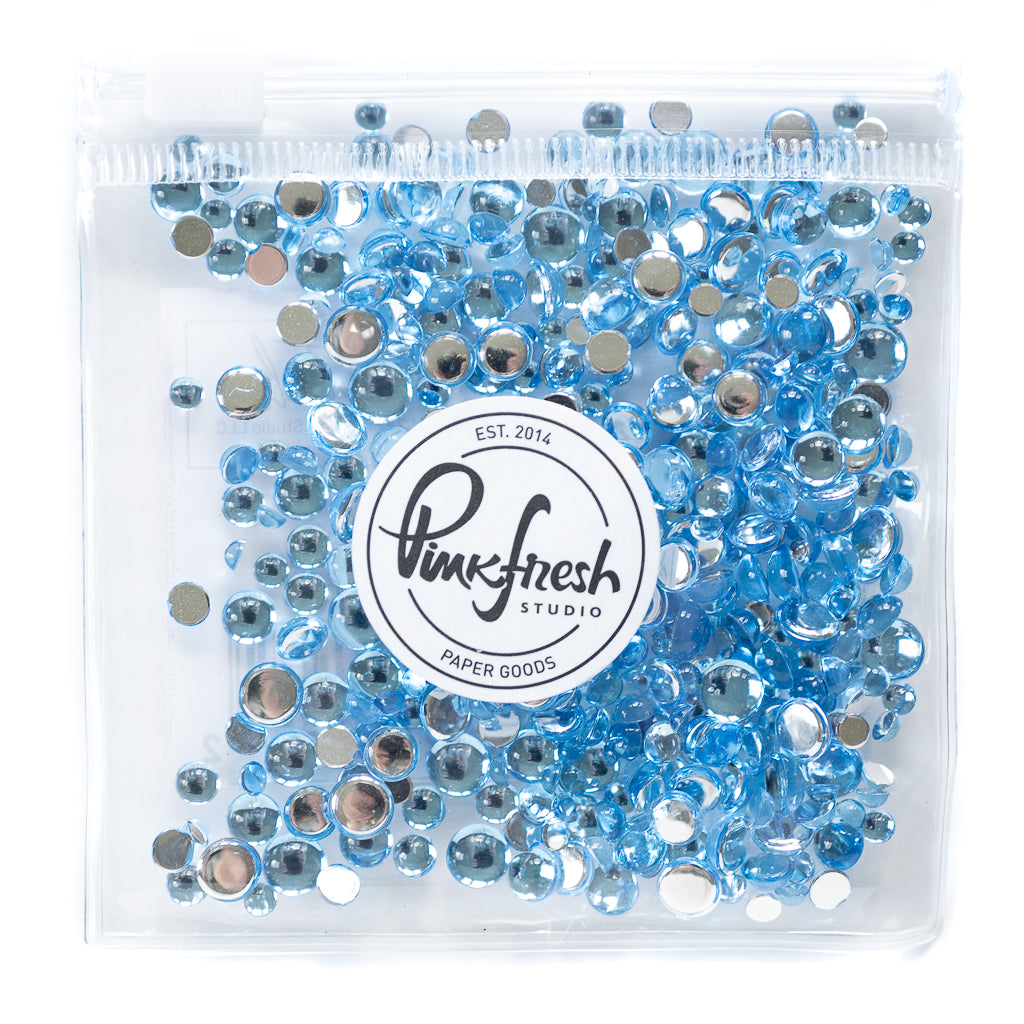
- Finish both cards with a few Sky Blue Clear Drops for a subtle touch of shine.


I love how the same floral image can take on such a different feel simply by changing the color temperature. A tone-on-tone palette is an easy way to create a cohesive design.
One small stenciling tip for the flowers is to leave parts of the petals uncolored. This creates more contrast between the layers and keeps the flowers from feeling too heavily colored.
Thank you so much for stopping by! I hope these two cards inspire you to play with different color palettes while using the same design elements!
TaeEun
Recommended Products

































Leave a comment
All comments are moderated before being published.
This site is protected by hCaptcha and the hCaptcha Privacy Policy and Terms of Service apply.