
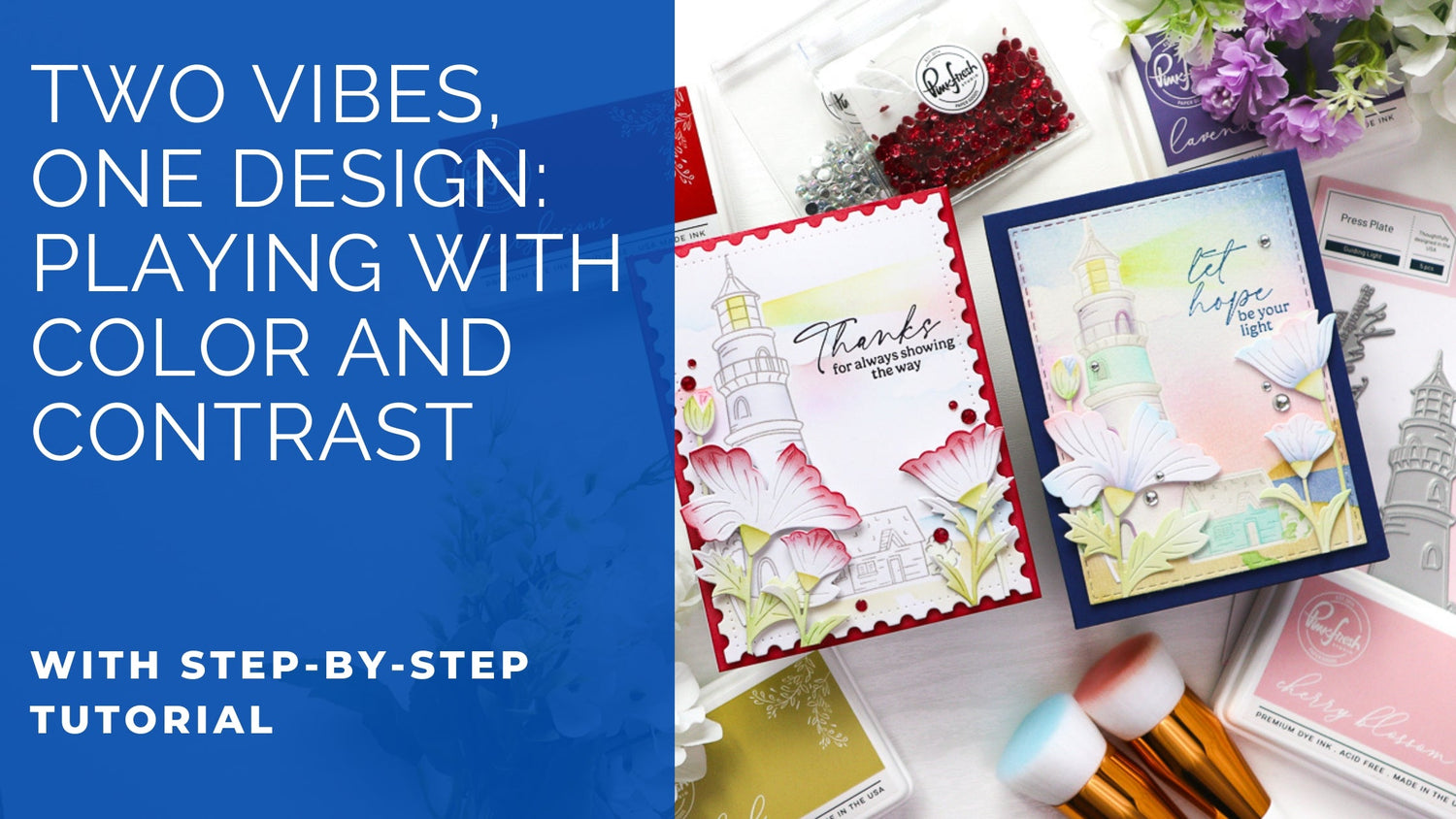
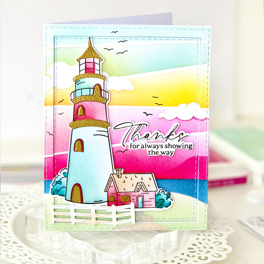
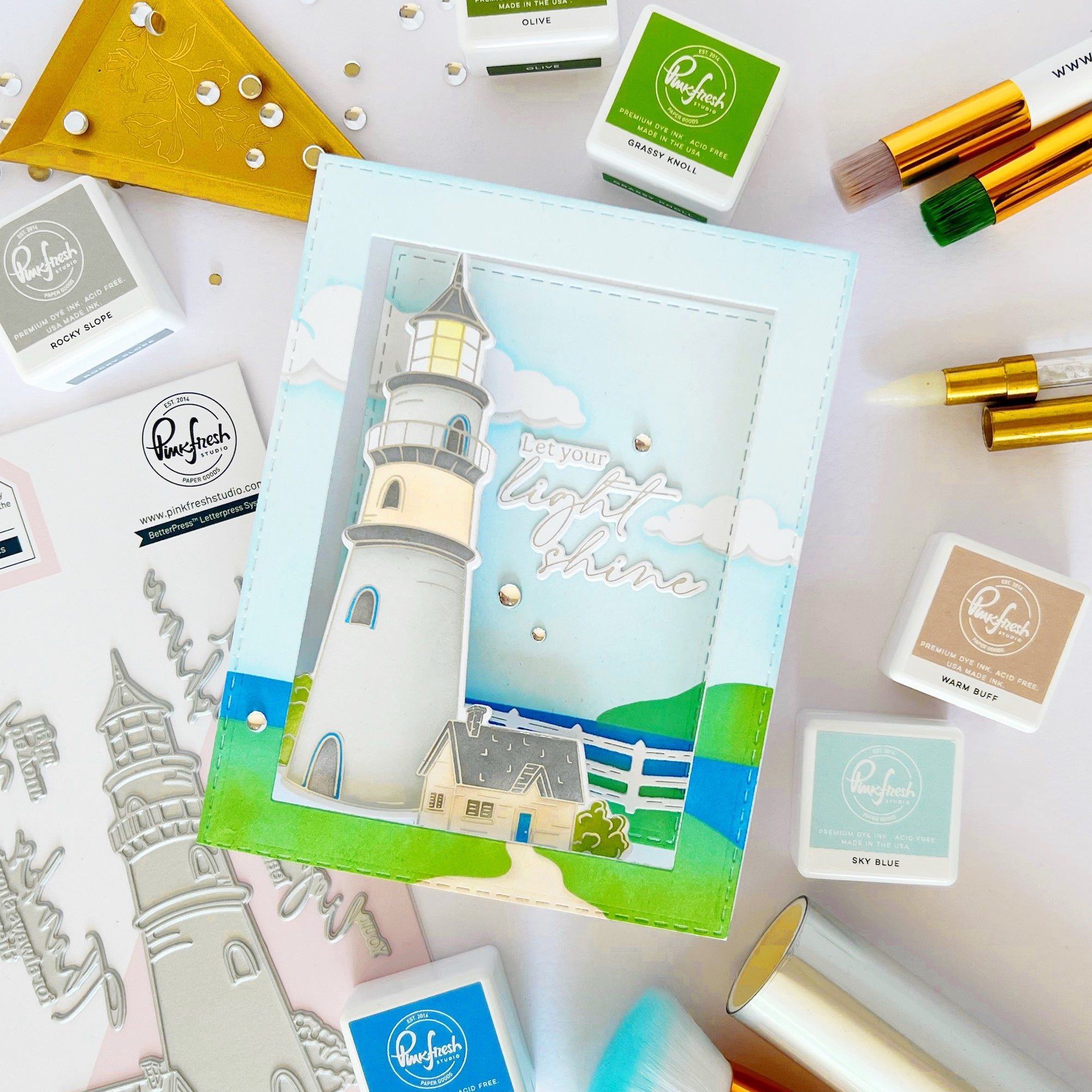
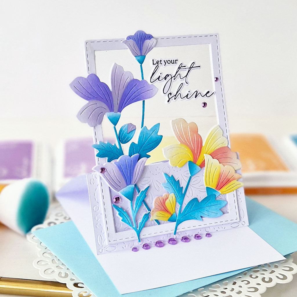
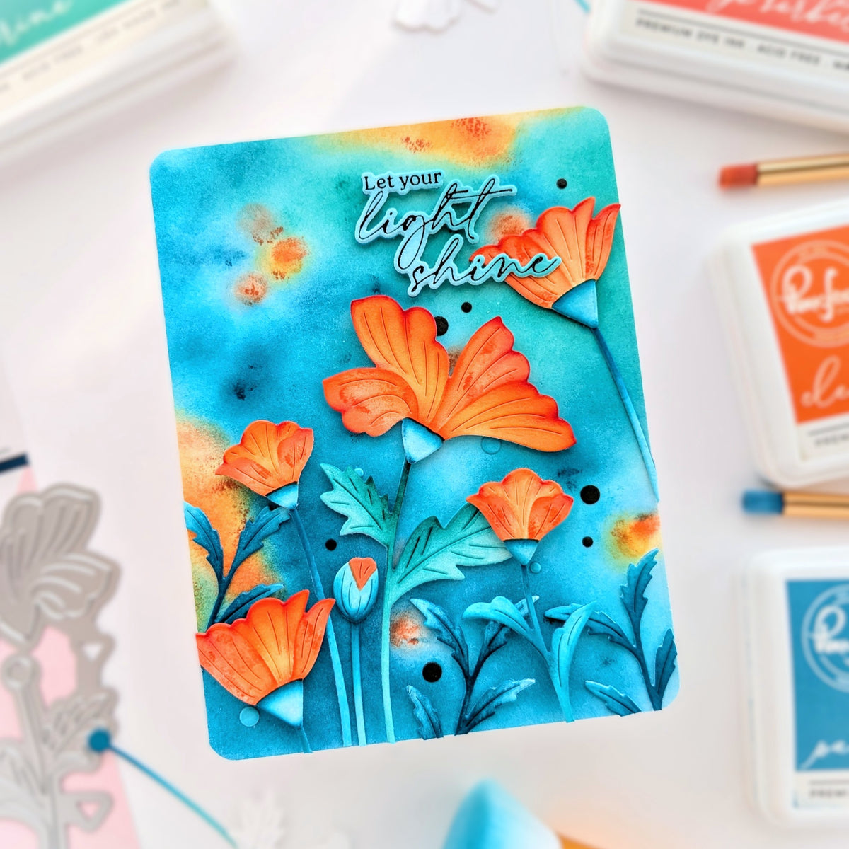
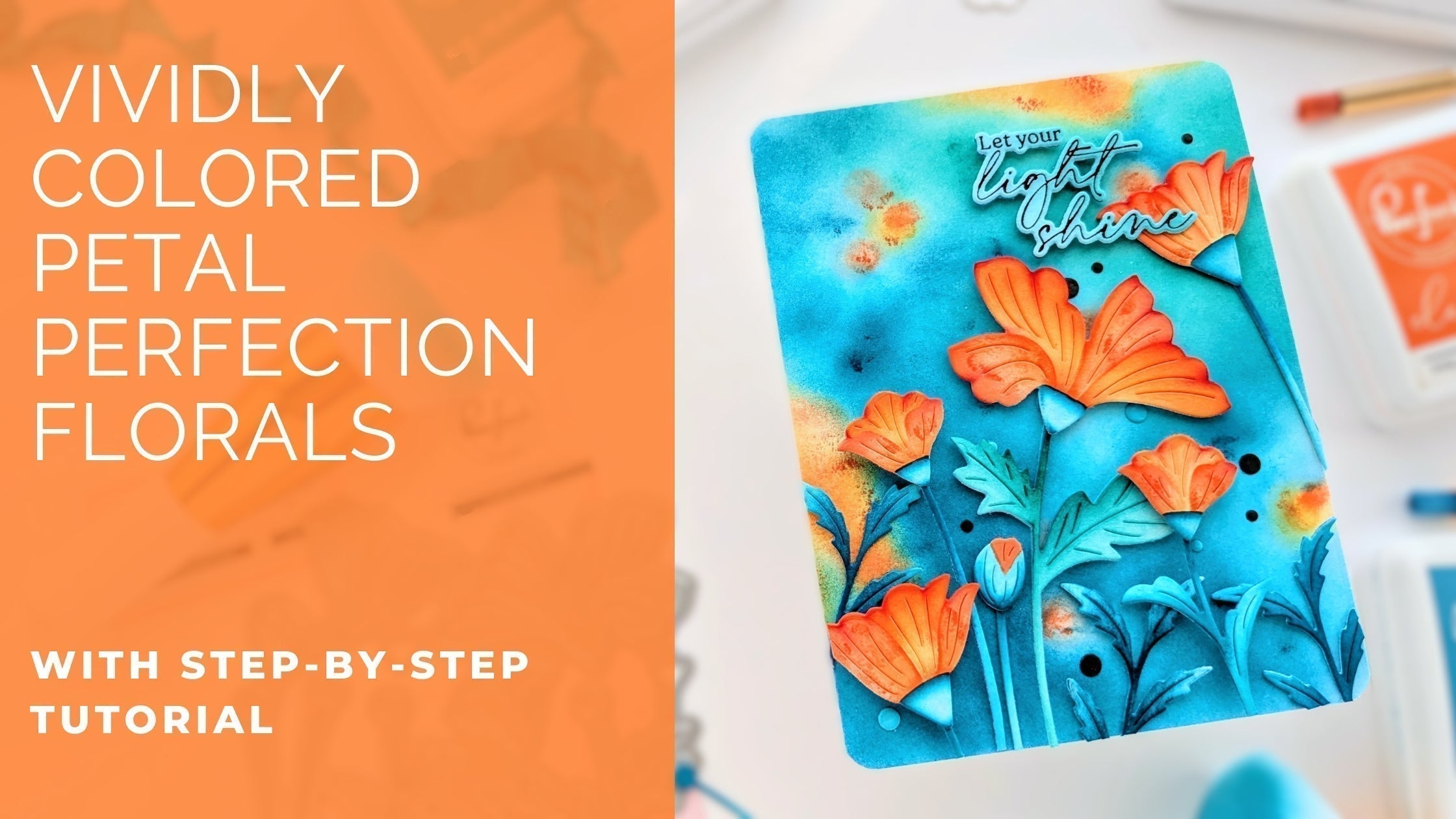
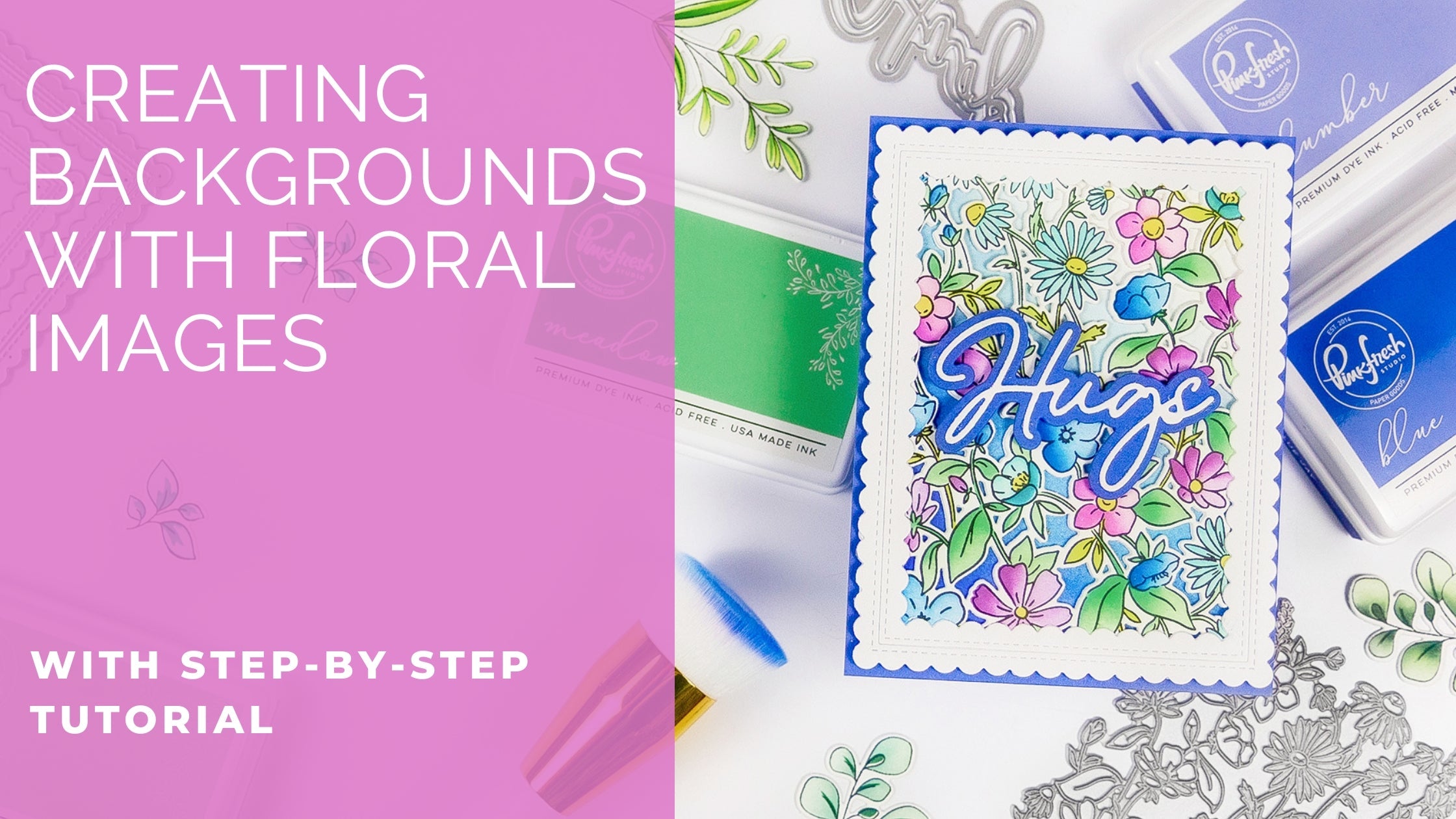
Hello everyone! Hope you’re having a great week so far! It’s TaeEun here today with a couple of cards featuring the Guiding Light and the Petal Perfection suites from the Sunshine & Smiles Release. I used the scenic image from Guiding Light as the background and arranged the poppy flowers (I think they are! :)) from Petal Perfection in the foreground.
For the first card, I colored the Guiding Light image only partially and lightly to draw attention to the flowers. In the second card, I used soft pastel tones for both the Guiding Light and Petal Perfection elements to create an overall dreamy, delicate look.
*Disclaimer: All products used are linked below as clickable images. If a product isn’t listed, it’s been discontinued.
Here's how I put it together:
Card 1

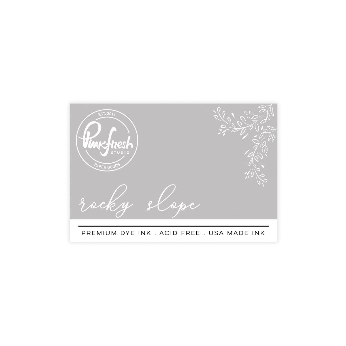
- Press the Guiding Light in Rocky Slope on a white cardstock panel.
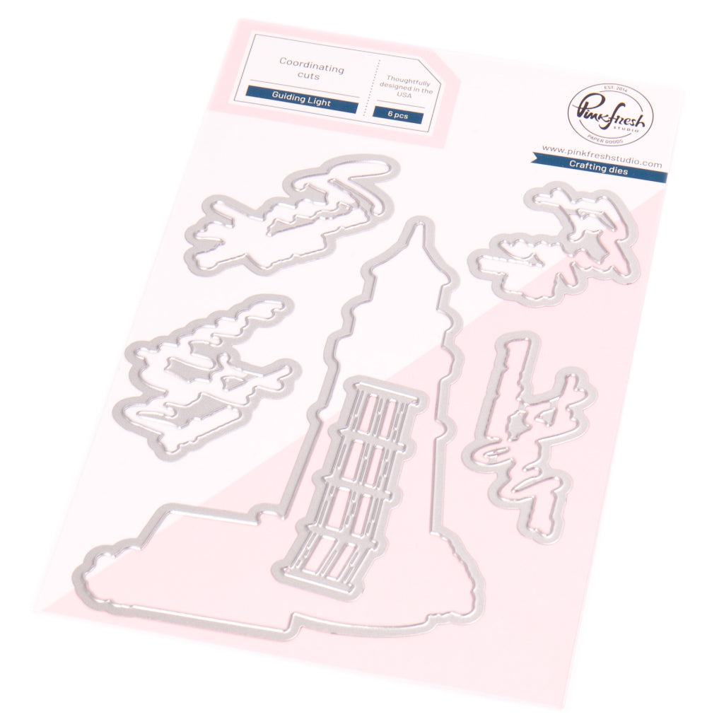
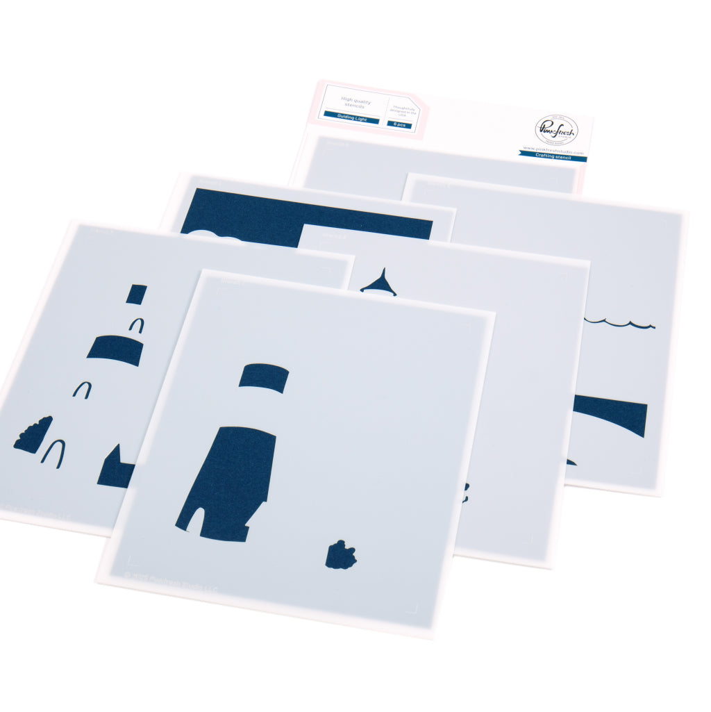
- Die cut the Guiding Light using the coordinating die from printer paper to use as a mask.
- Mask the Guiding Light image and stencil the background.
- Sky around the clouds: Lavender, Cherry Blossom, and Sky Blue
- Sea: Sky Blue
- Ground: Warm Buff and Bay Leaf - Lightly color the edge of the light house in Sheer Freesia and add the light with Sunshine.
- Ink blend the light beam shining towards the sky with Sunshine.
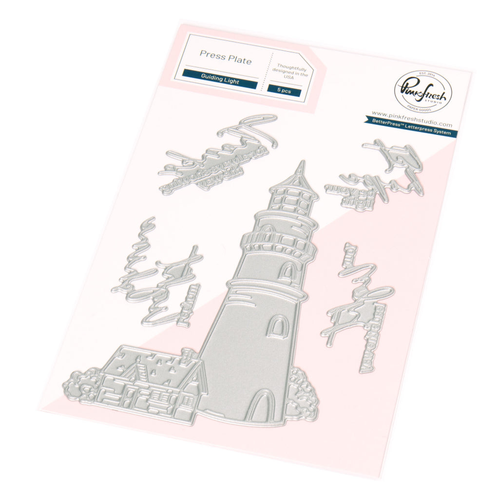
- Press the sentiment from the Guiding Light Press Plate set in Detail Black onto the background panel.
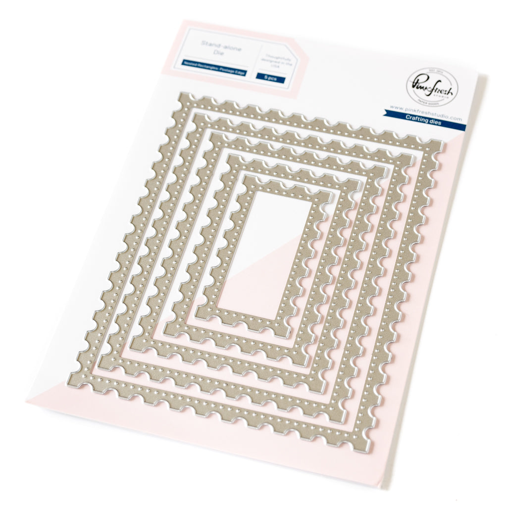
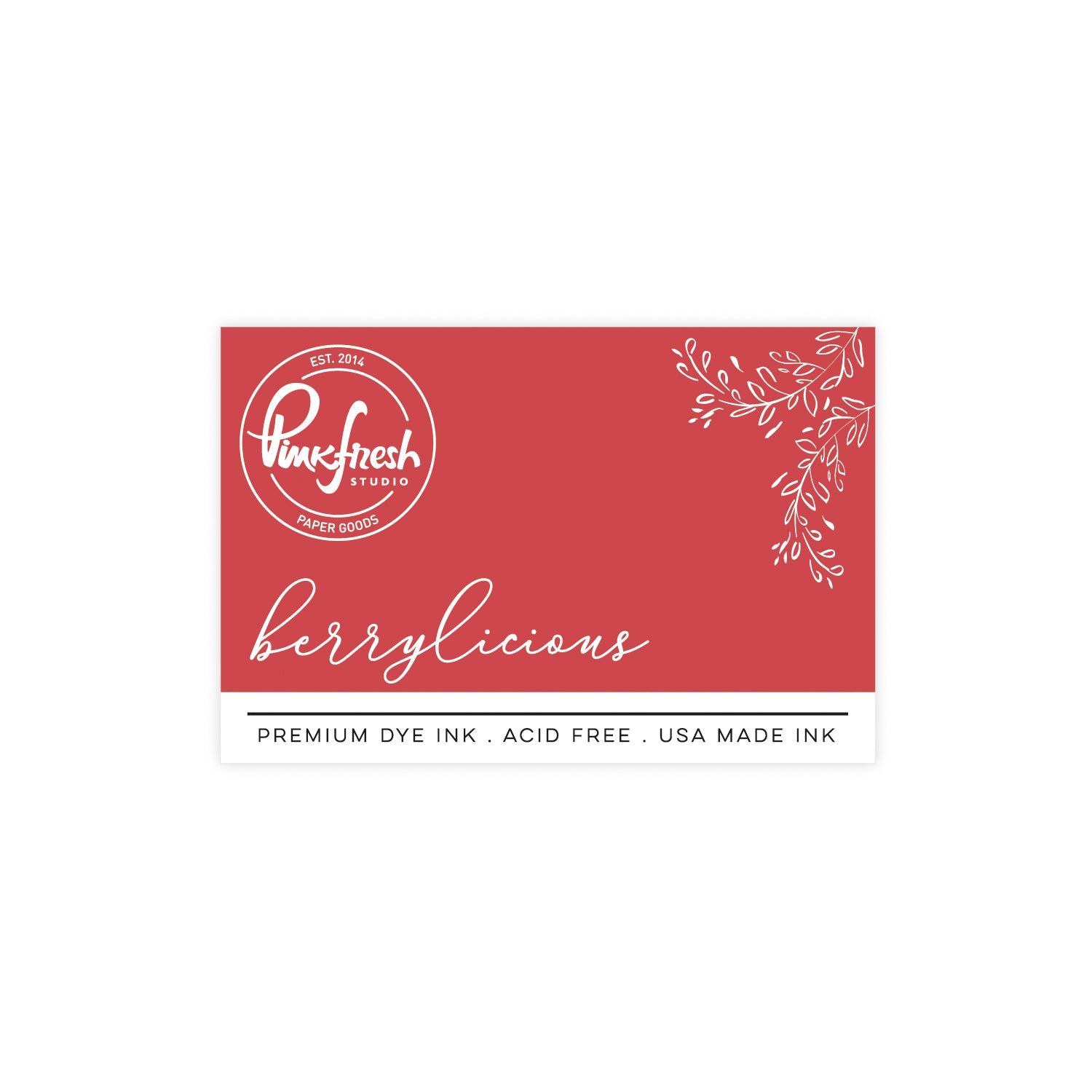
- Die cut the background panel with the largest die from the Nested Rectangles: Postage Edge set and foam mount it to a cardbase , the edges of which you’ve ink blended in Berrylicious.
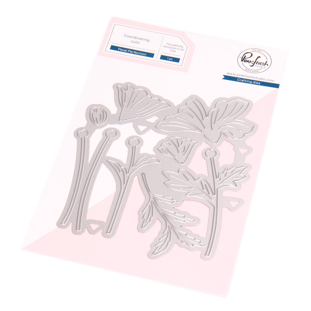
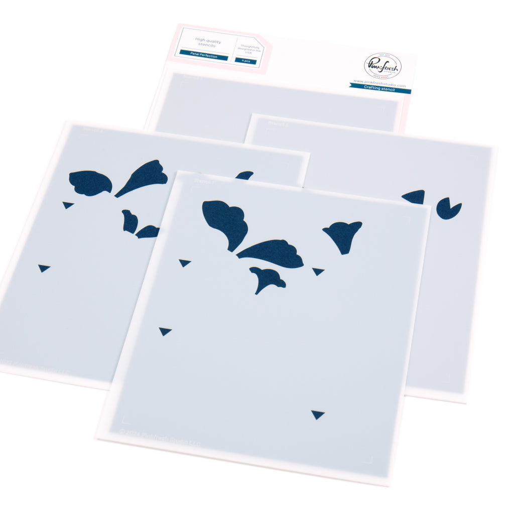
- Stencil the Petal Perfection and die cut with the coordinating die.
- Greenery: Bay Leaf and Key Lime
- Tip of the petals:: Berrylicious - Die cut Petal Perfection again from white cardstock.
- Curve the tips of the stenciled petals and layer them over the white die cuts for added dimension.
- Arrange the flowers onto both sides of the card as shown in the picture.
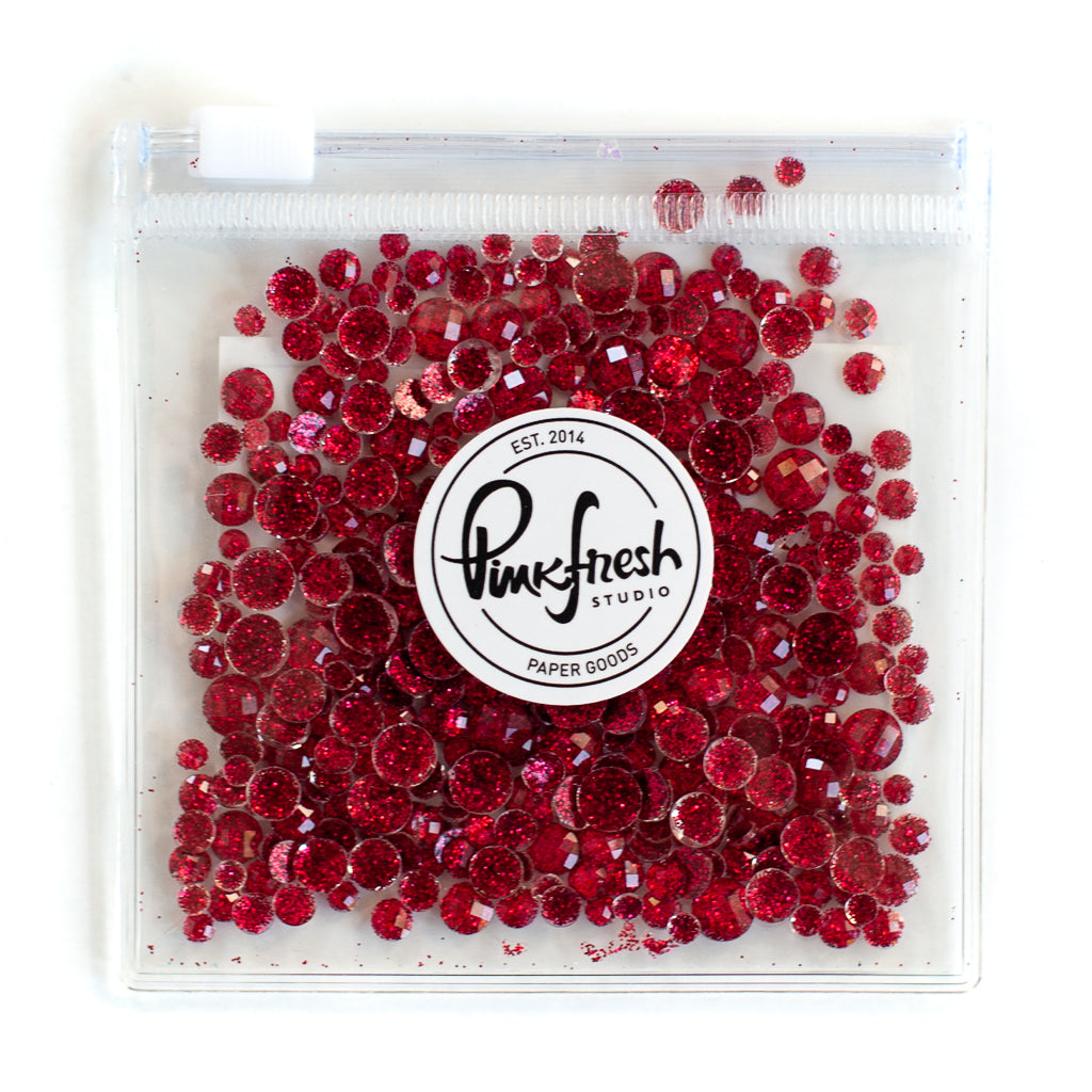
- Embellish with a few Ruby Glitter Drops.

Card 2

- Press the Guiding Light in Misty Coast onto a mixed media panel.
- Make a mask for the Guiding Light image and cover it.
- Stencil the background.
- Sky: Waterfall, Storm, Cherry Blossom, Lavender and Misty Coast
- Sea: Storm
- Road: Key Lime
- Field: Bay Leaf and Warm Buff - Stencil the lighthouse in Sheer Freesia, Lavender, Mint, Waterfall and add the light in Sunshine.
- Press the sentiment from the Guiding Light Press Plate set in Storm onto the background panel.
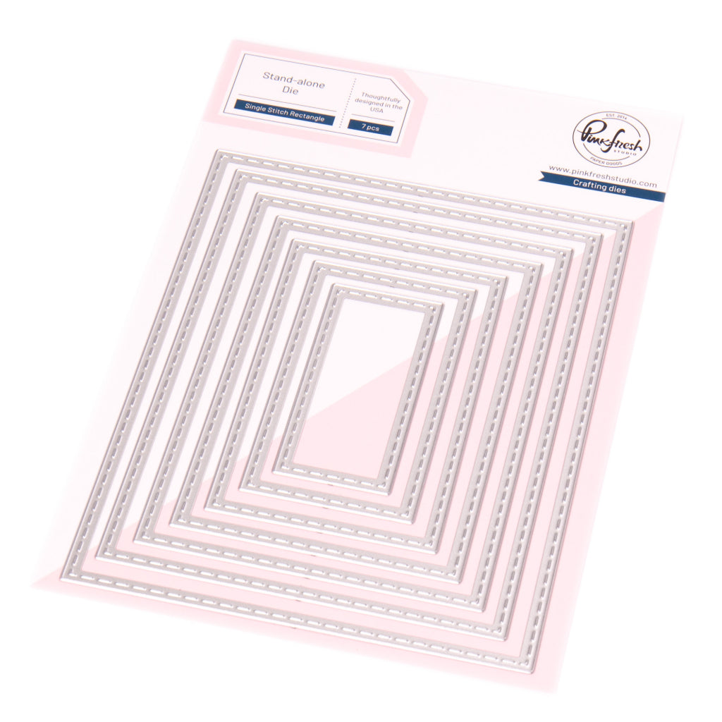
- Cut the background panel using a die from the Single Stitch Rectangle die set and foam mount it onto a navy cardbase.
- Stencil the Petal Perfection and cut with the coordinating die.
- Flowers: Sky Blue, Sheer Freesia, and Cherry Blossom
- Leaves: Bay Leaf and Key Lime - Arrange the flowers along the bottom of the card as shown in the picture
- Finish with a few Iridescent Clear Drops for a subtle sparkle.

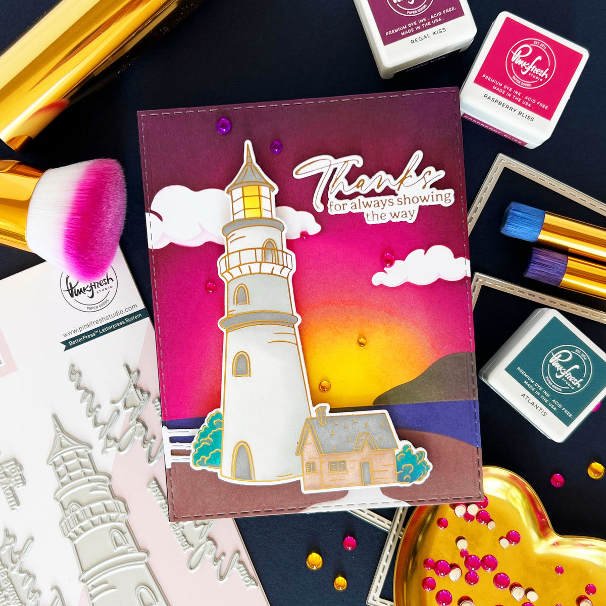
I wanted to show you how much a color scheme can change the mood and feel of a card, even when using the same elements.
Tip: Don’t be afraid to experiment with colors. An overall light look in soft pastels can evoke calm and elegance, while bold tones set against a muted background bring energy and focus. Let your colors shape the mood and story of your card !
Thank you so much for stopping by today!
Have a crafty day!
TaeEun
Recommended Products































Leave a comment
All comments are moderated before being published.
This site is protected by hCaptcha and the hCaptcha Privacy Policy and Terms of Service apply.